Here's the full film!
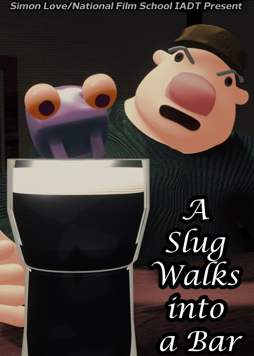
I figure I should treat this as a portfolio of sorts so here's some final renders from the film that I think I really popped off making. Might've gone a bit hard on the colour grading when I was doing the compositing but whatever, live and learn I guess.
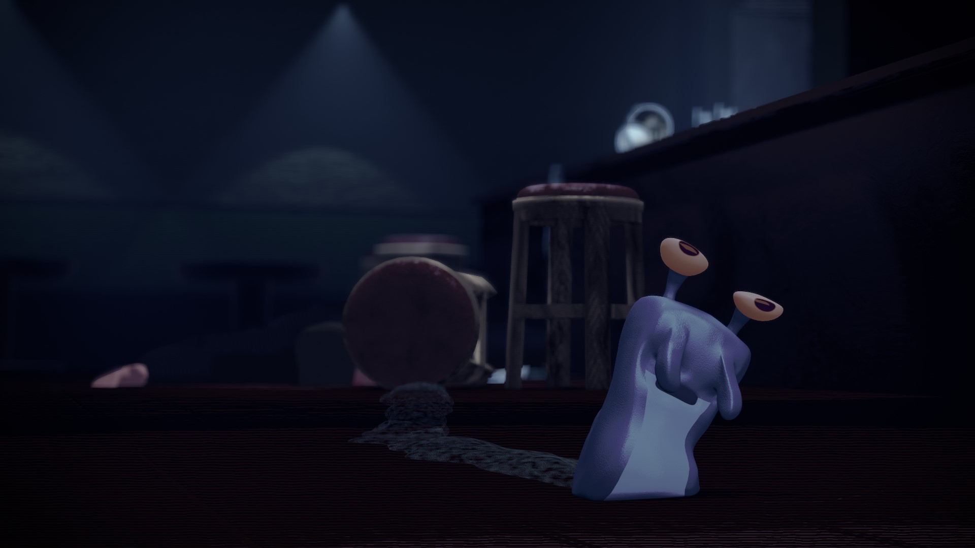
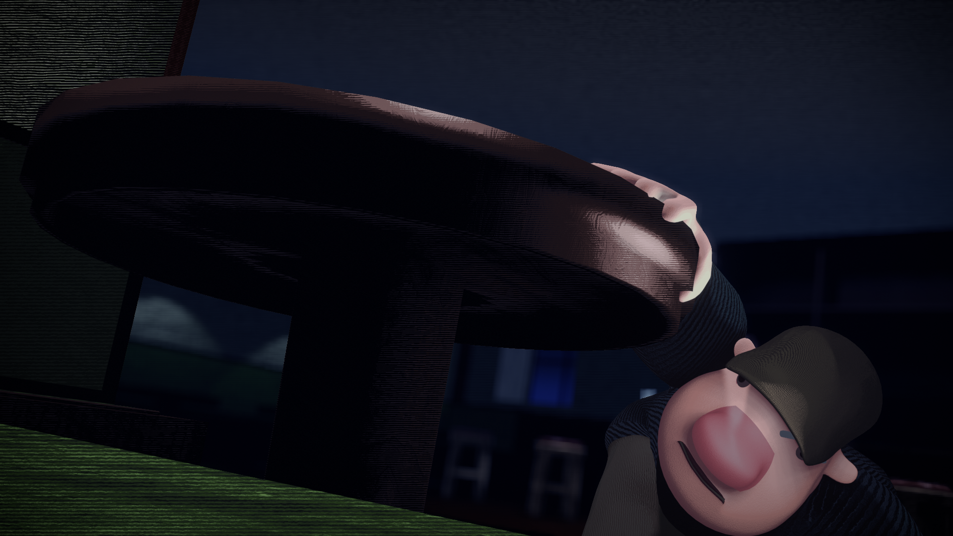
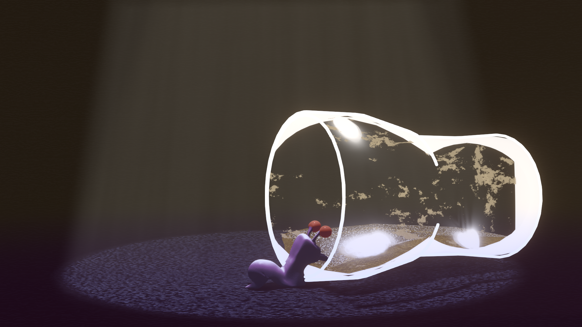
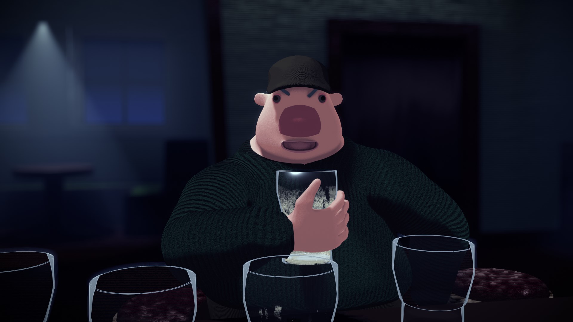
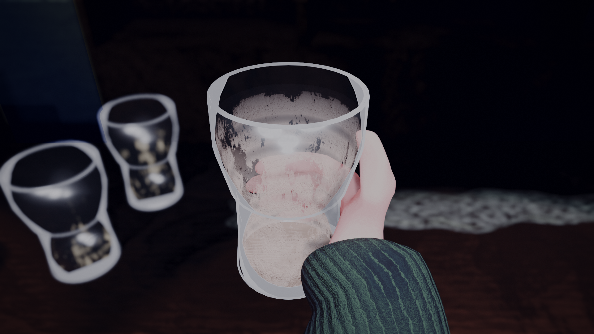
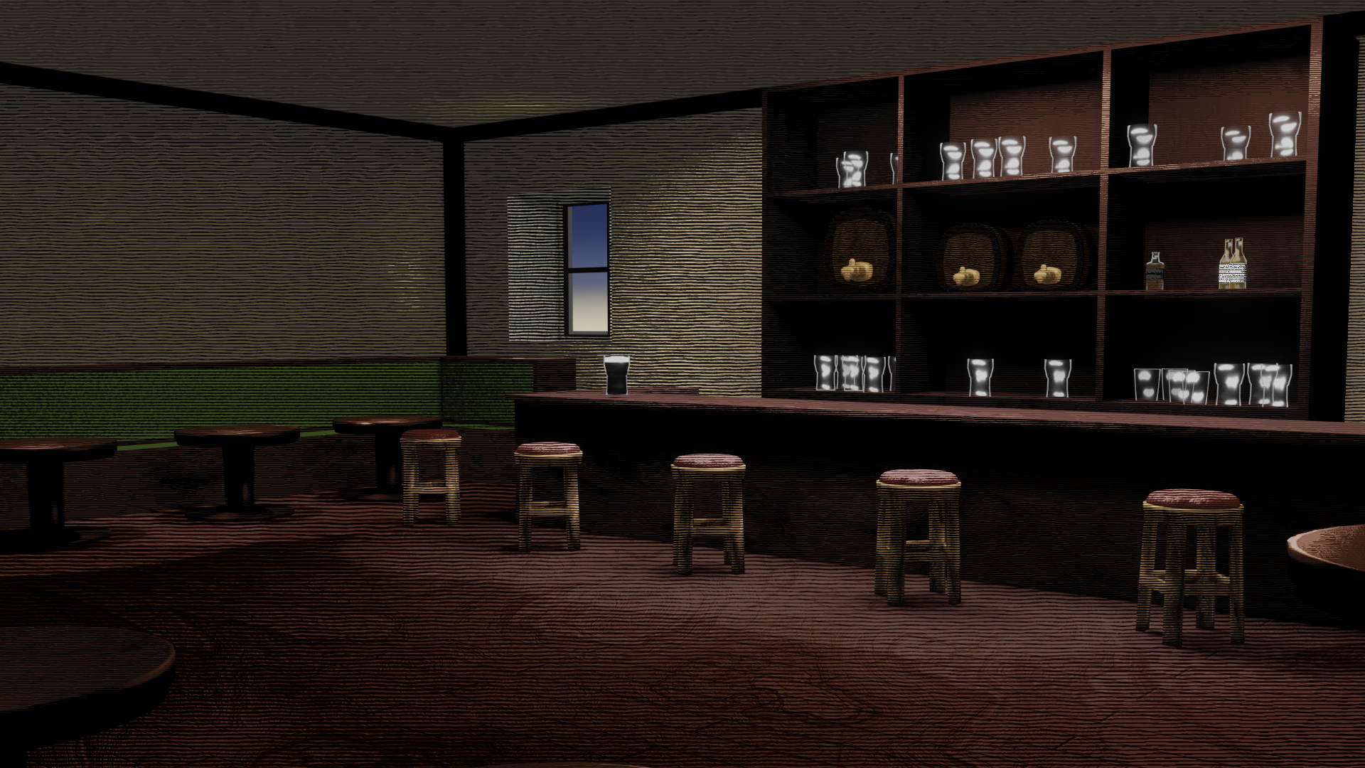
Now that that's nice and visible at the top I think it'd be a fun idea to have this as a behind the scenes kind of page where I go through like everything from the production.
One day I was informed that slug eat stamps off of post. That nugget of info changed my life. I needed to know more, I needed to do something with this knowledge. This was somewhere deep in lockdown. 2nd year had just ended and I was feeling useless because I wasn't up to anything and had no creative drive after finishing up with college for the year. But the slug fact got me thinking. At first I was picturing my Junior Cert English teacher who collected stamps (and who would probably crucify me for not putting a comma before "who", but I don't answer to him anymore) struggling to barricade his home from an onslaught of hungry slugs. That was the core of the idea, which I used as a starting point in 3rd year while planning for the 4th year film. But in the initial moment there were a few other ideas running around my head.
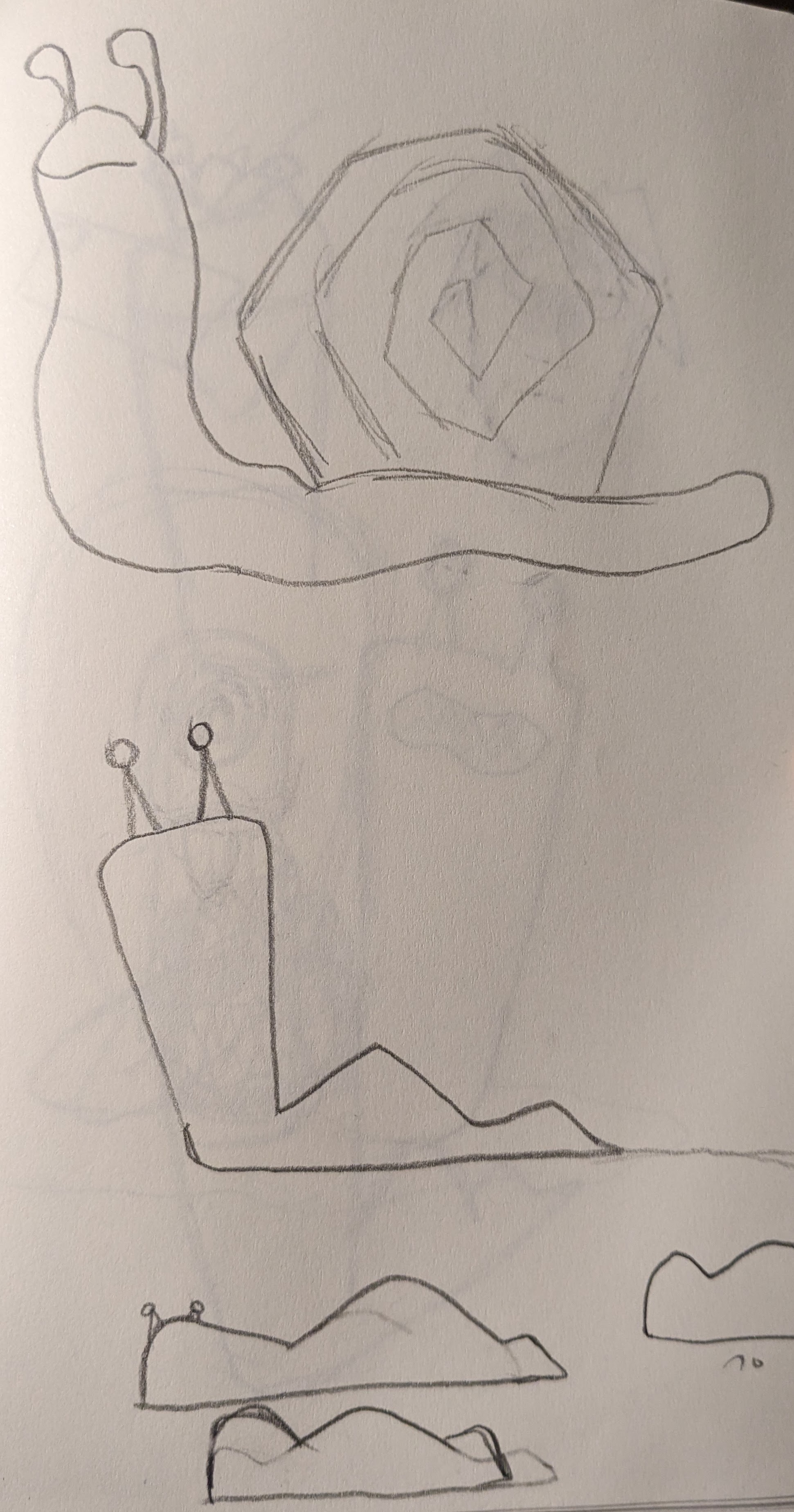
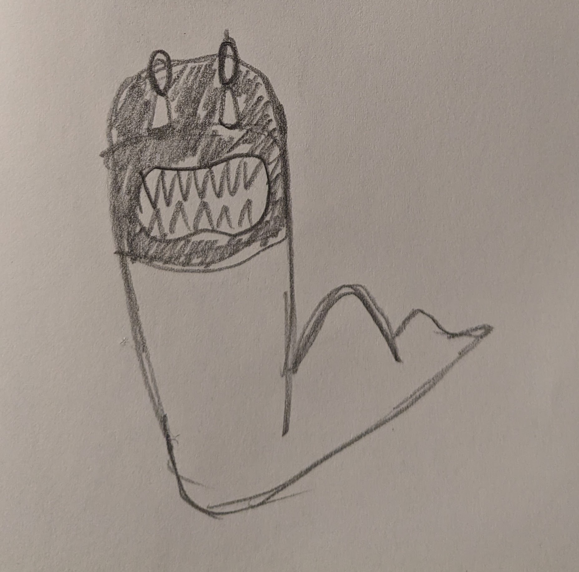
I started off by doing a few sketches to try and figure out what a slug would look like in my "style", except I didn't really have a style at the time so really I was just messing about with different stylised ways of drawing a slug. The idea of a slug thief was already emerging at this stage.
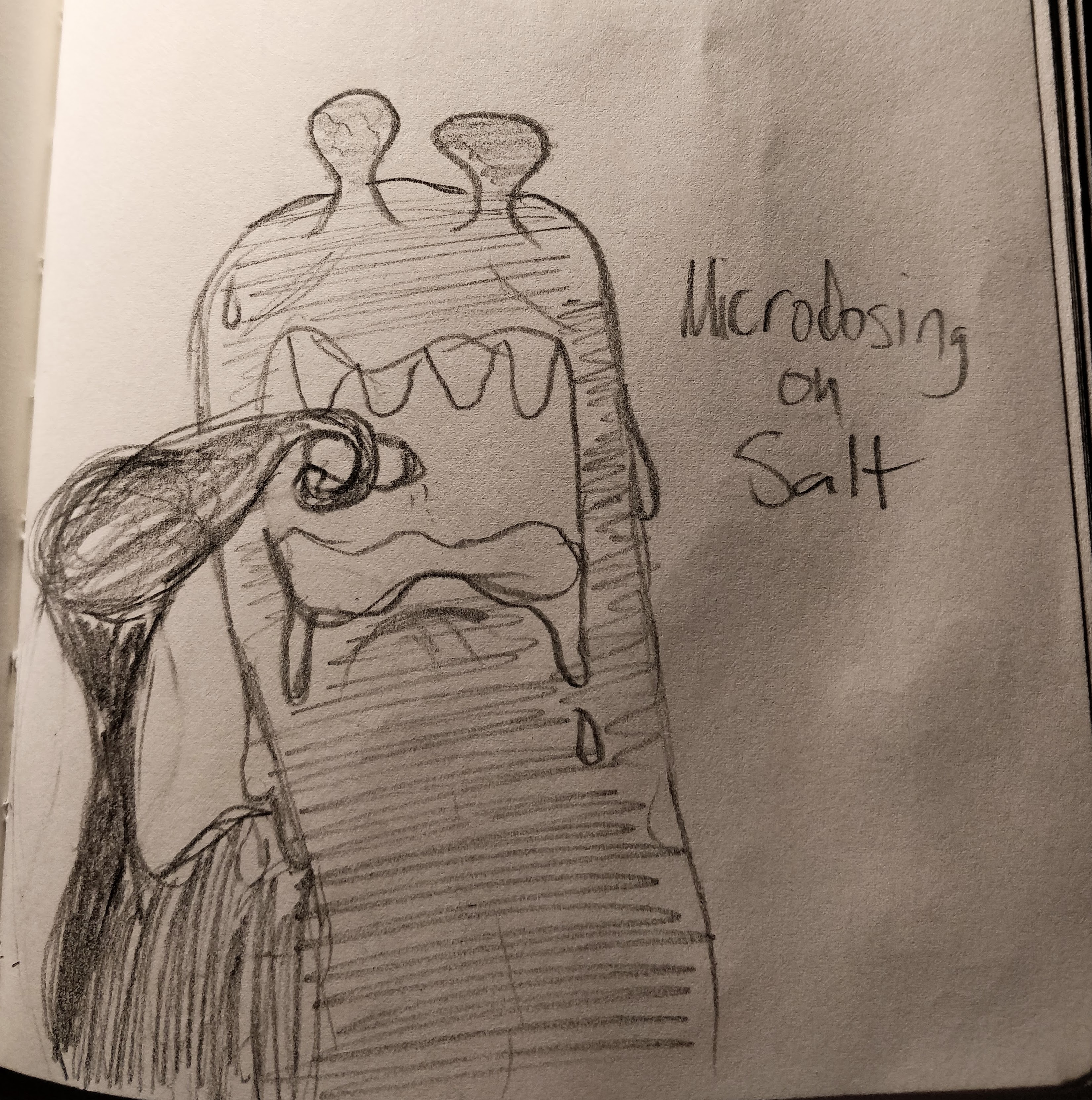
I didn't have any concrete ideas for characters yet but I did come up with one slug who microdoses salt to build immunity to it. Pretty sure I was listening to Black Midi when I drew this one and I think that comes through.
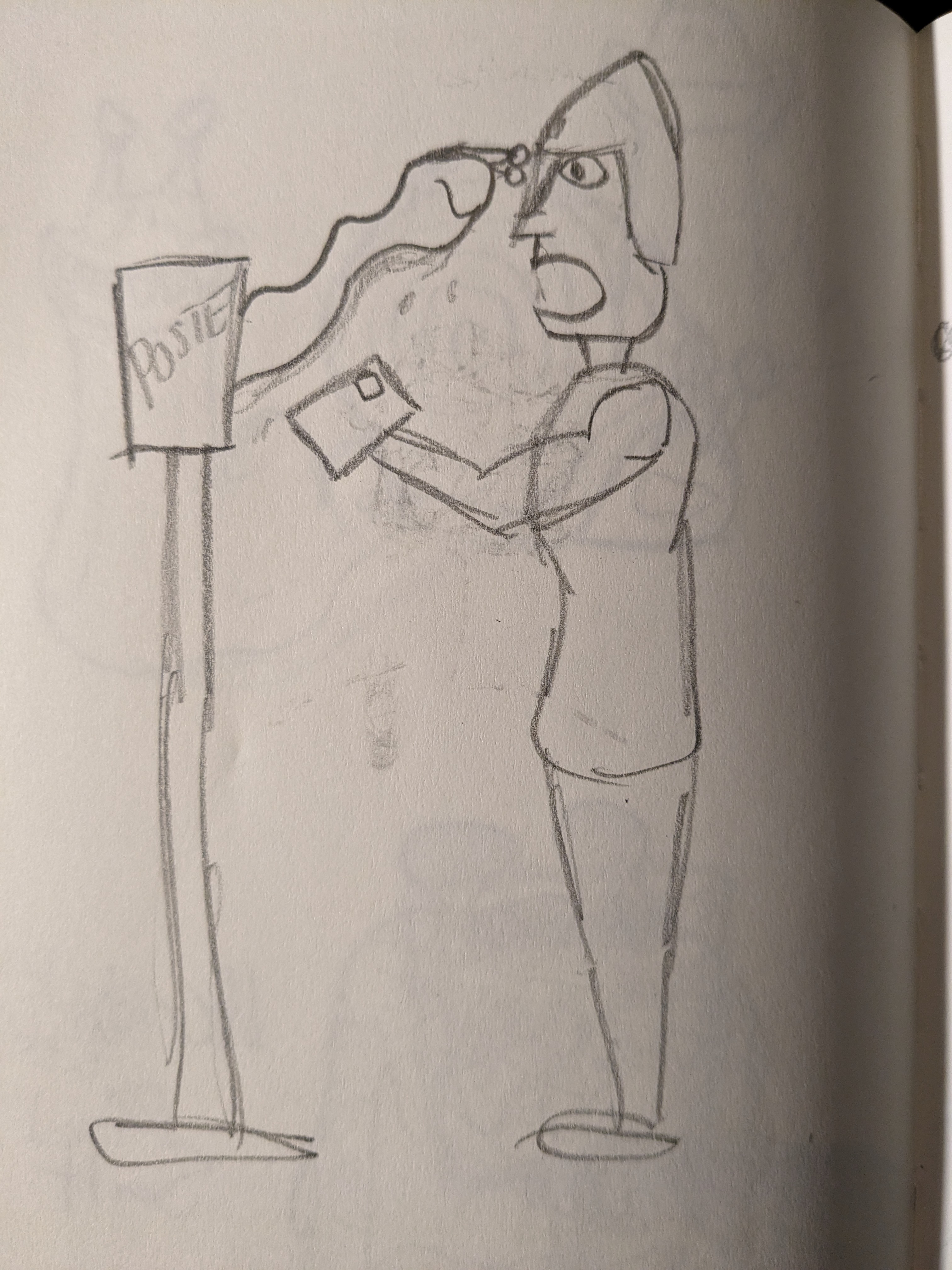
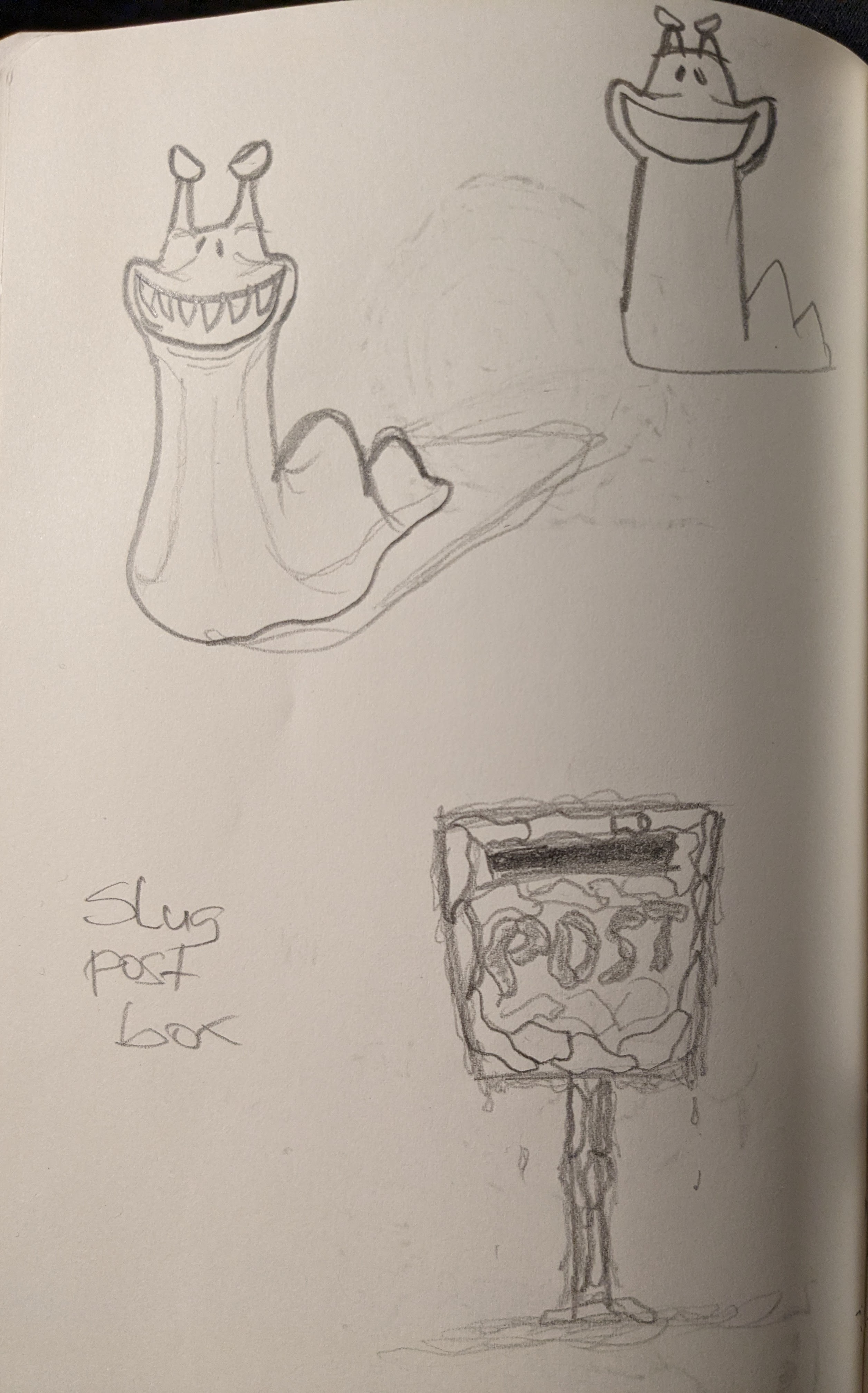
One of the ideas that I was gravitating towards more involved a team of slugs, and their nemesis The Postman. I'm not sure why I've gone with a medieval knight style guy in the first pic. I think it was in reference to those manuscripts where sometimes there'd be guys fighting slugs drawn in the corner for whatever reason. Anyway at this stage the idea revolves around some crafty slugs that can join together to morph into a postbox shape to steal letters and eat the stamps off. Nonsensical but in a funny Wil E Coyote painted wall kinda way.
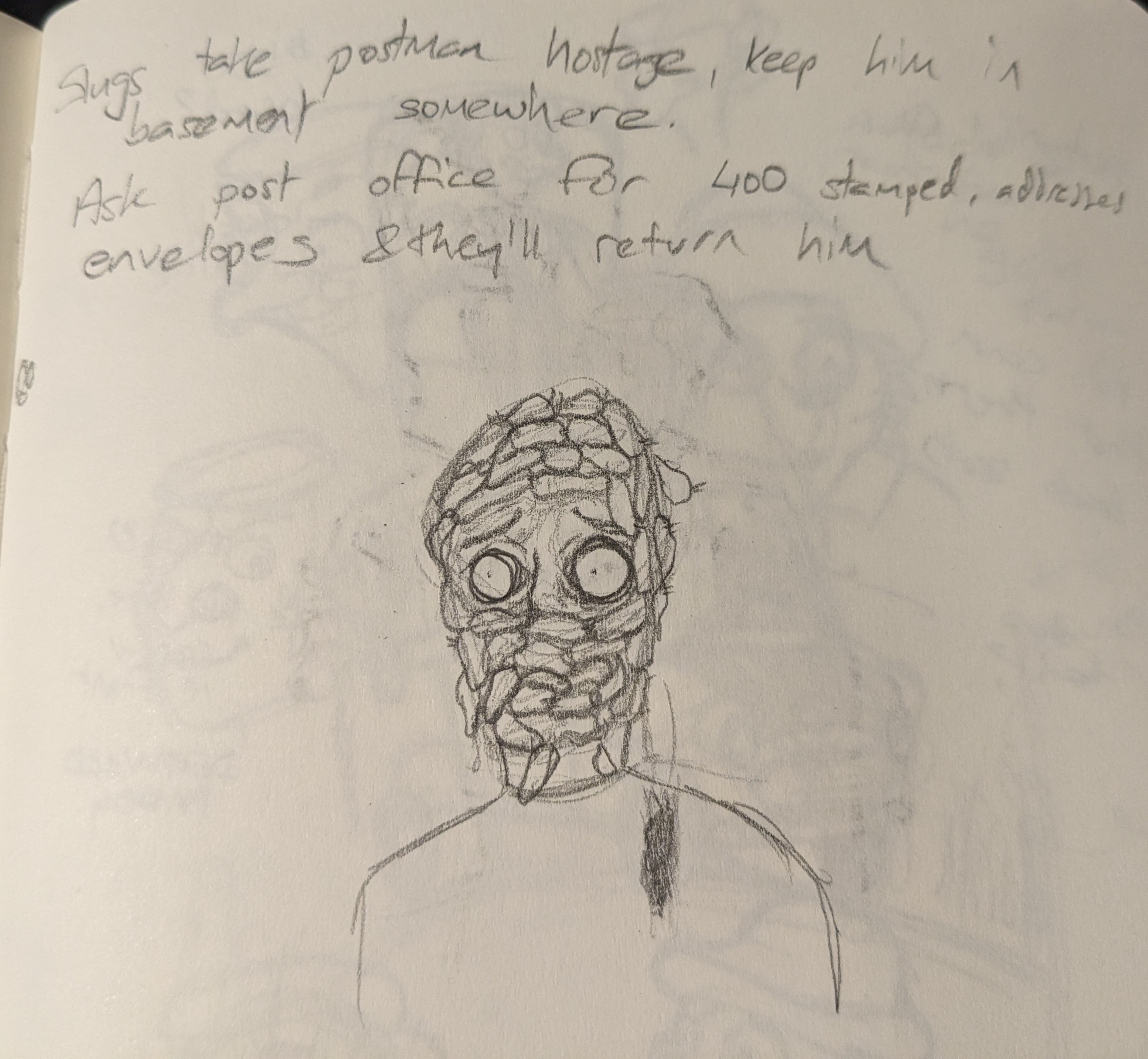
I'd completely forgotten about it until I started putting this together but apparently they were gonna be hostage takers at one point. Maybe I'll return to that idea some day.
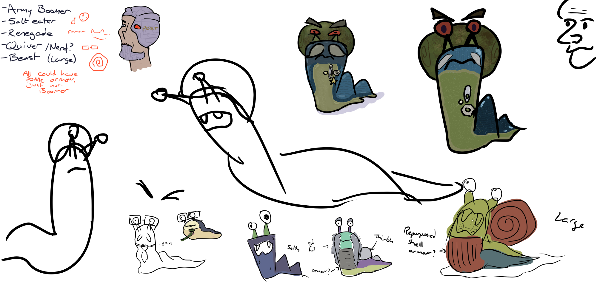
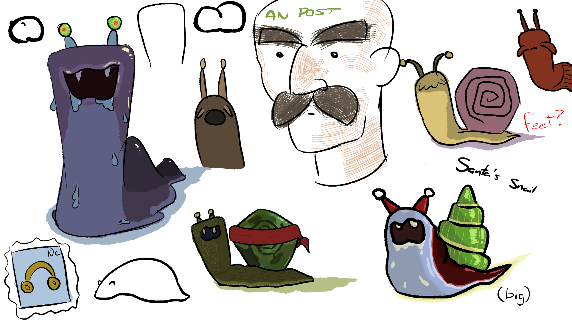
These are some fun little designs from when I was brainstorming what different slug characters would look like. They wear scraps and little objects that they find lying around the place. As far as I remember the army general slug wears a shell on his head that he prized off a snail in a slug vs snail war. Maybe a little dark. At this stage I don't think I'd settled on which species was going to be focused on more. I think the reason he's happy to work with snails here is that the idea is in a post-apocalyptic setting at this stage. I don't think I have any images showing that though. But the idea is that the grassland that the slugs usually live in has dried up in the summer because of climate change, forcing the snails and slugs to find another food source, which leads them to the stamps. It's not really an apocalypse from a human perspective yet at this point, but it's certainly getting tough for the slugs. I toyed with the idea of it being a dystopian future for humans too, which can be seen in the postman with a bionic eye. More accurately, he's Post-Man, a cyberpunk evolution of humankind. I wasn't certain if I wanted to commit to that idea though or if I just wanted it to be a funny misconception of the slugs' once they'd heard of men.
I moved away from the idea at this point, until I was planning for my 4th year film.
I'm not sure where the sketchbook is that I was using mostly at this time so I'm gonna have to skip some of the early sketches for now. In 3rd year I had to pitch my idea for my final year film. I had a few ideas in mind but in the end it came down to a project about the journey of a coin, and the different scenes it's seen throughout its life. That would've been a 2D project, and I moved away from it partly for that reason. It also didn't really have much of a direction other than "wow coins must really see a lot passing through all those hands". The slug plan was to be a mix of 3D and 2D at the time, with the characters being 2D. I went all 3D instead to build experience. I felt I got the basics of 2D and all I had to do to improve was practice, but with 3D there was a lot that I hadn't learned how to do properly.
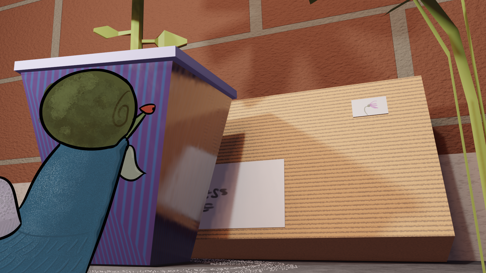
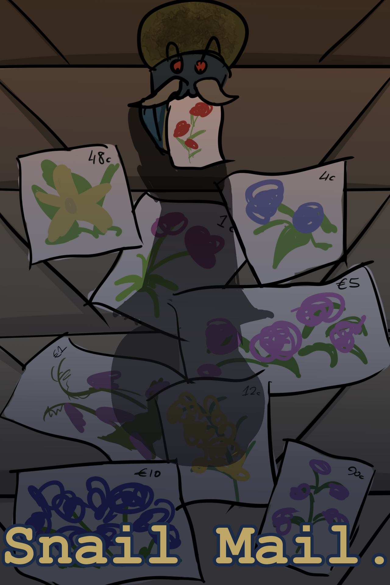
The main character here would've been the Military Slug that I'd designed before. The idea was that he'd just be vibing in the way slugs do, until he notices a parcel outside a gaff with a flower on the stamp. Attracted to this, he'd eat it and develop an addiction for stamps, leading to him carrying out a heist on a post office. Looking back I'm glad I didn't go with this idea because I wasn't doing a heist film out of a love for them. I'd not really seen any so it would've just been a vague pastiche based on the more famous tropes. The heist was the main plan for a couple of months but it swapped between taking place in a post office and in a stamp collector's house. The slug didn't really have much character at this point either aside from the hunger for stamps. I wasn't even sure if he'd be cartoony and slick or realistic and slow.
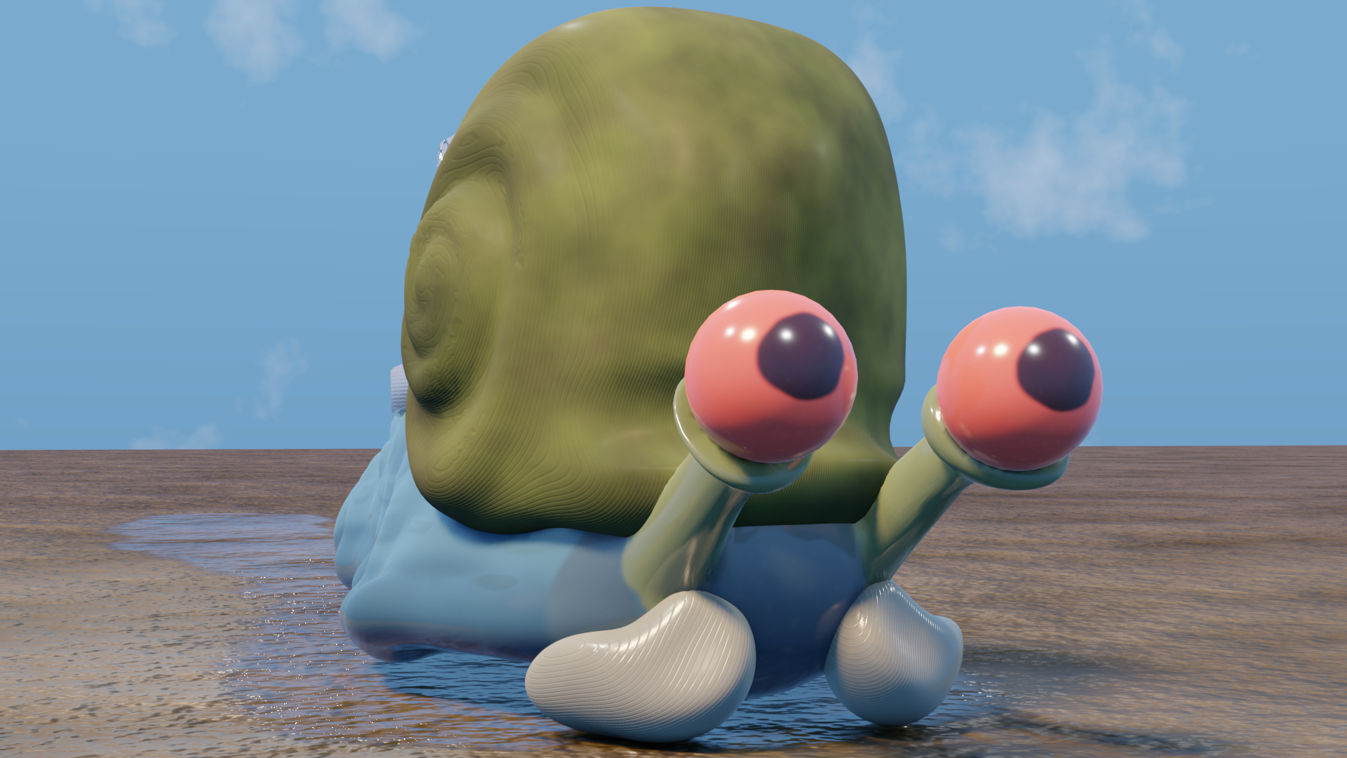
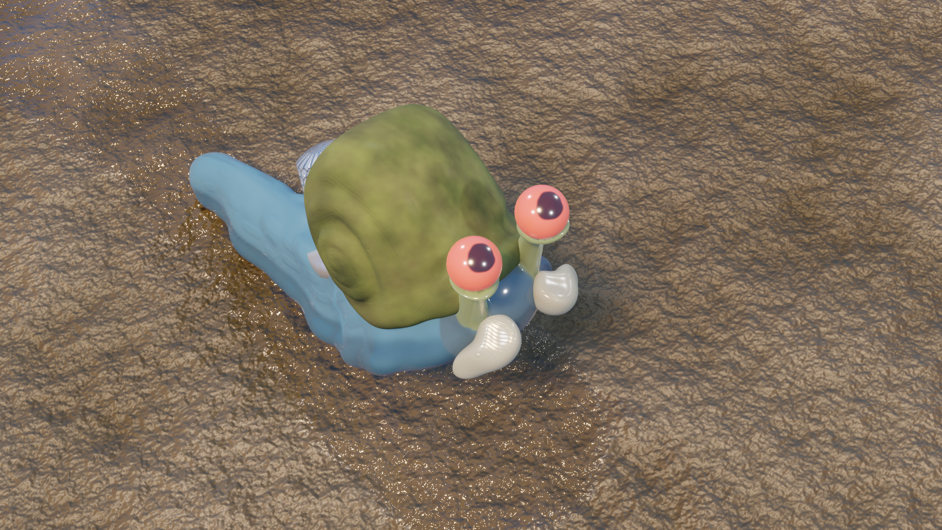
About a month into this planning stage I decided that the characters would all be 3D. I think really I just modelled this slug for the craic initially, I just wanted to mess around with sculpting in Blender. It's kinda funny I went to the effort of doing a slug model since I started my next presentation with the sad news that the slug wouldn't be playing as prominent a role as in the initial plan.
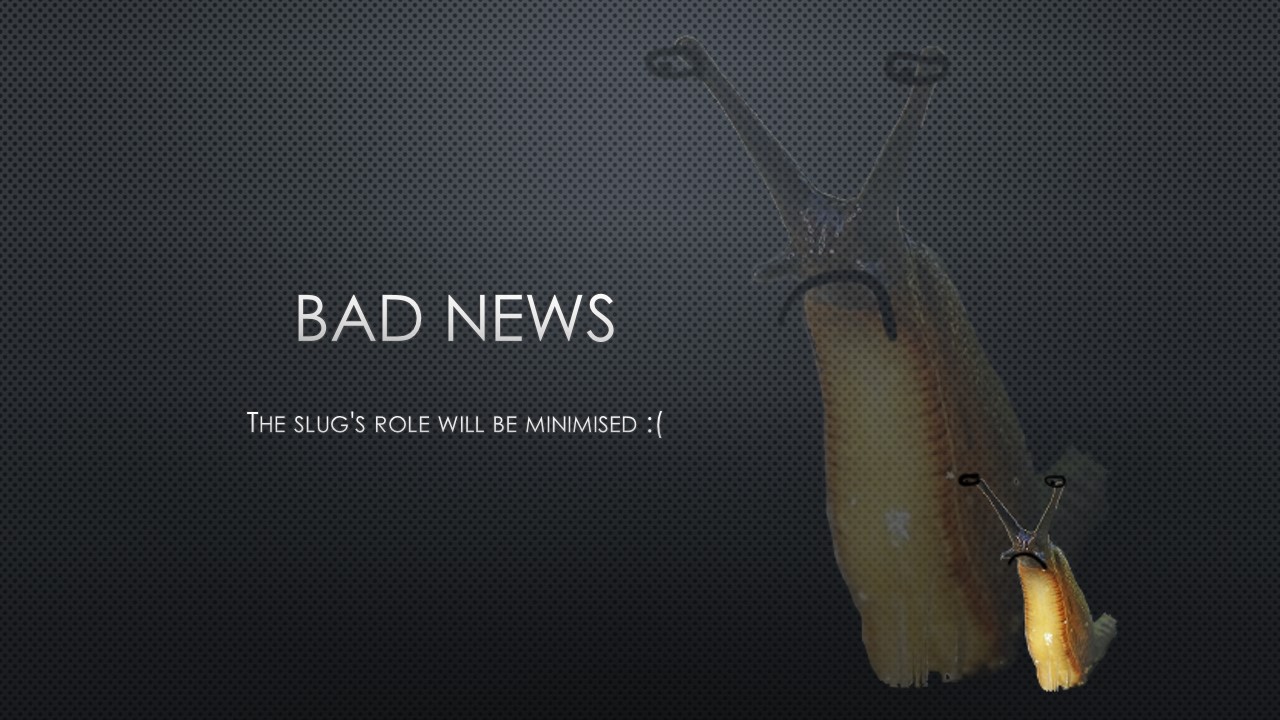
The story was now a detective story. Again I'm kinda glad it ended up not being a genre thing in the end because I wasn't that familiar with noir stuff either.
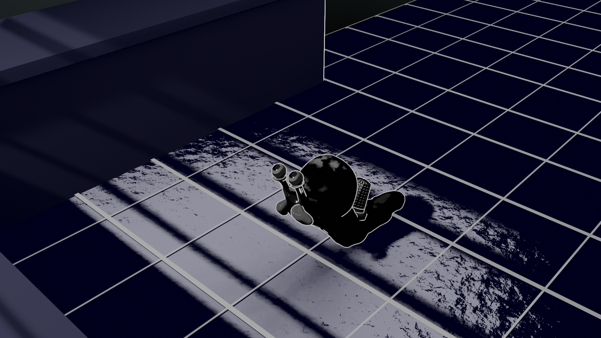
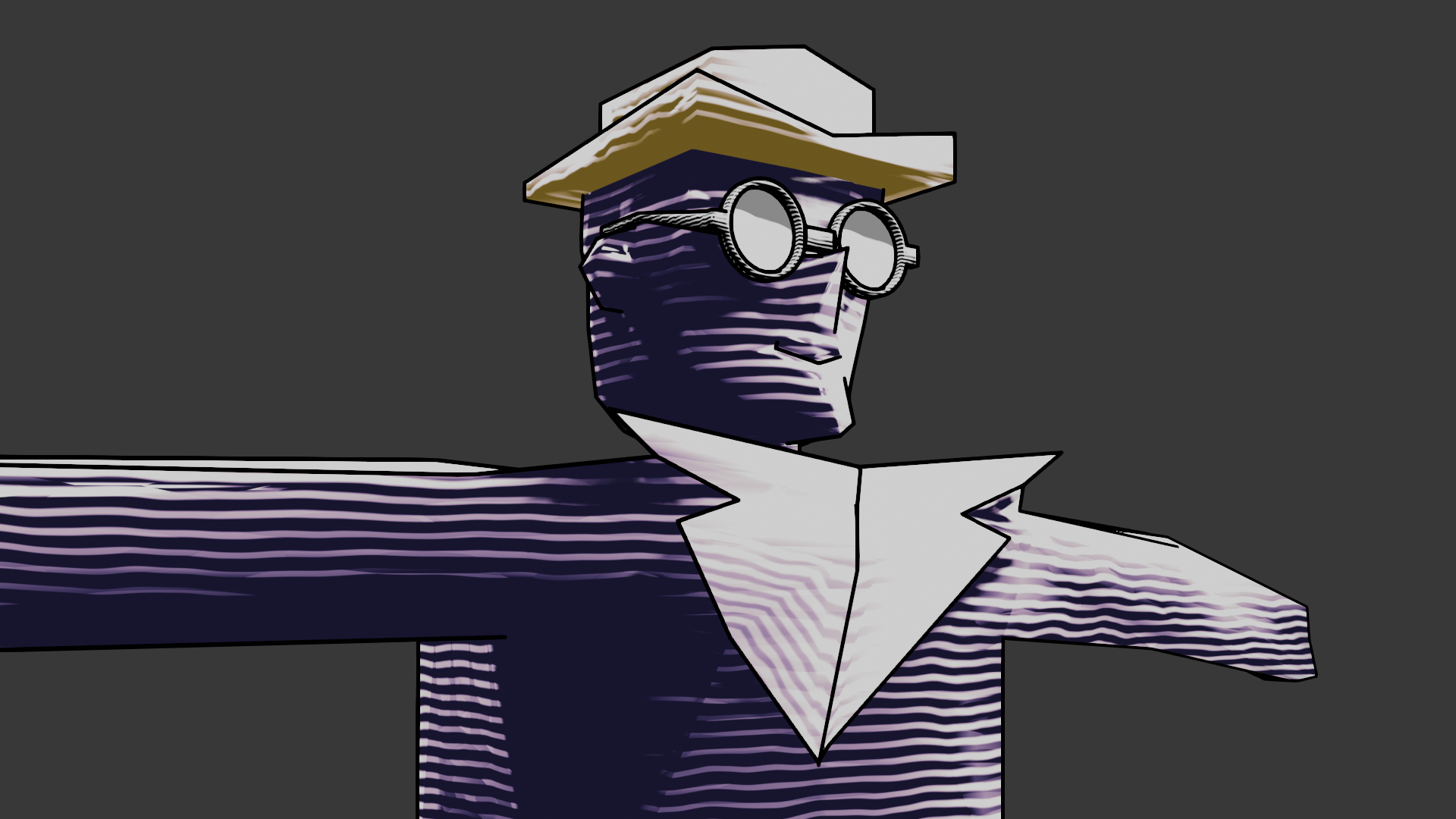
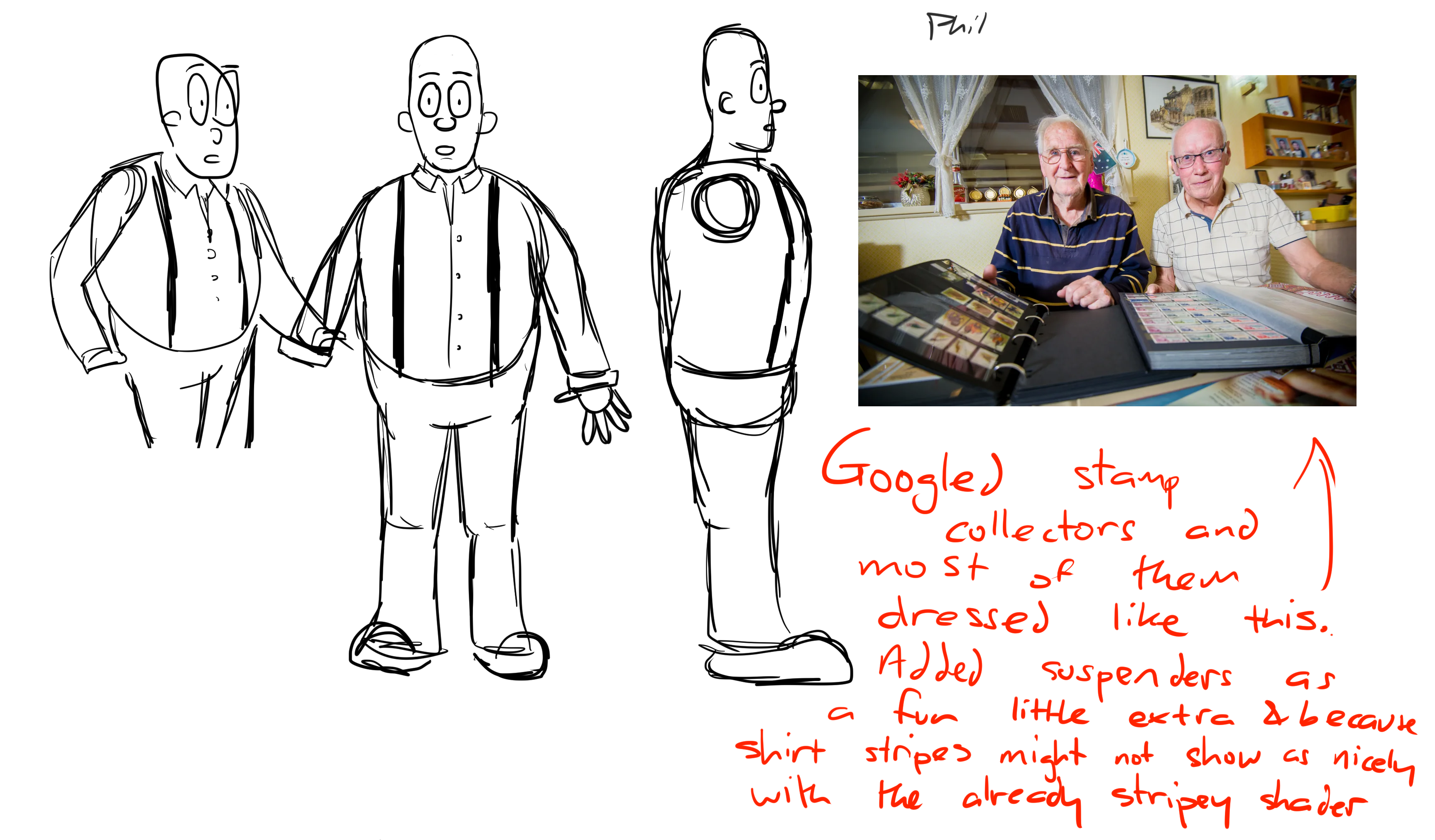
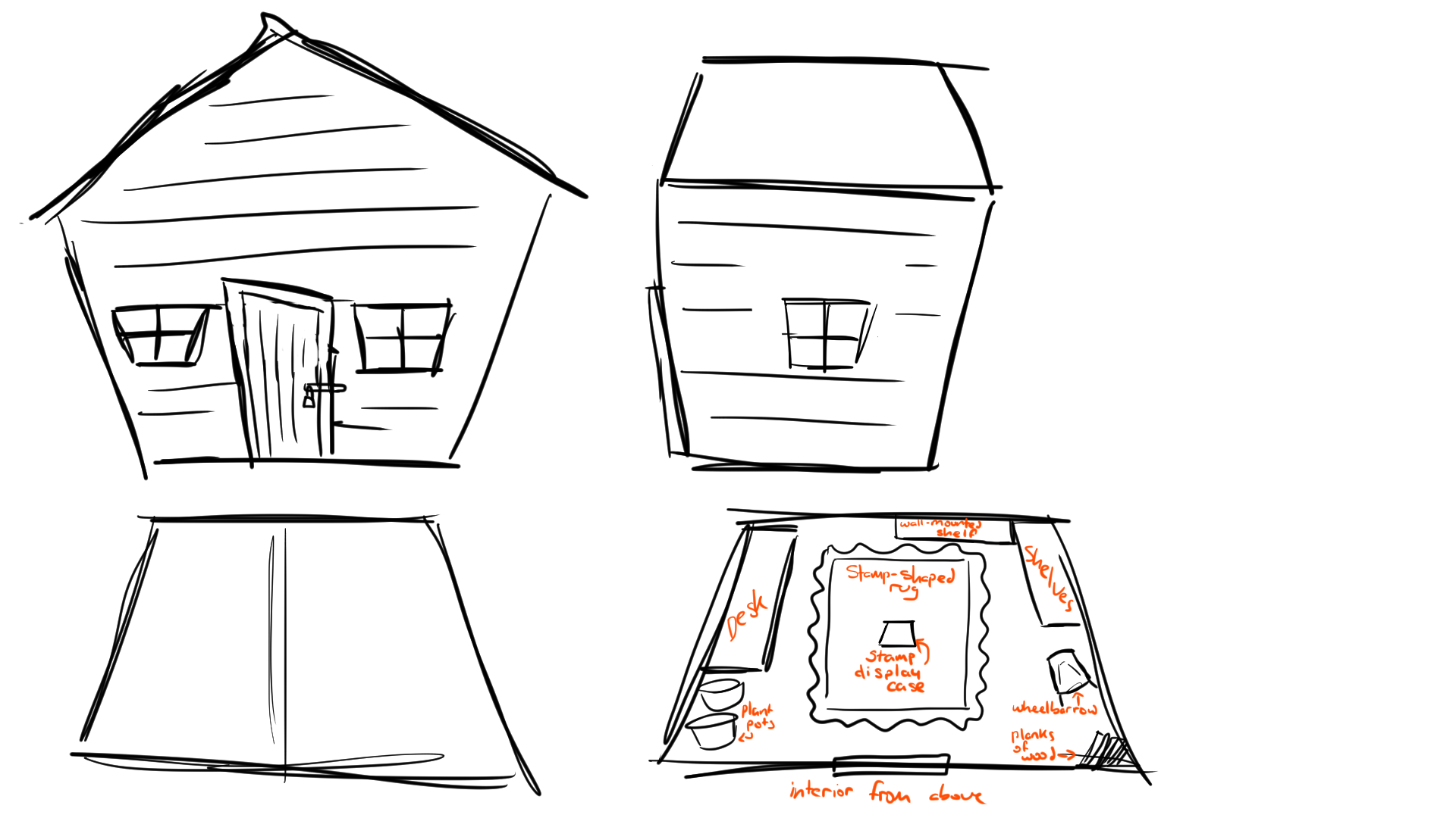
Most of the changes at this point are more text and story based than visual so I'll summarise what the story was going to be. Instead of the slug being the central character, the focus would now be on a detective. I think I planned for him to be capable and noir inspired (note: I didn't really know what this would entail) at first but changed it so that he'd be a bit of a fool who just stumbles on the right answer (he lives in a small village and his only exposure to crimes and investigations is through movies). Another change that happened in this era was the setting. Instead of a post office being robbed, I felt like there'd be more emotional stakes if it were a stamp collector that was robbed. A post office would just want the stamps back to keep up their stock and would maybe be more concerned with getting compensation for their loss (I assume) but a stamp collector would really care for the stamps and want them back for more personal reasons. Anyway, the stamp collector was to be called Phil Atley, a pun that nobody I mentioned it to got. He haphazardly builds a display case in his shed during a storm. A loud crash of lightning and a power cut startle him, and he runs off back to his house. The next morning he returns to the shed and the stamps are all gone. He calls up the detective and they investigate.
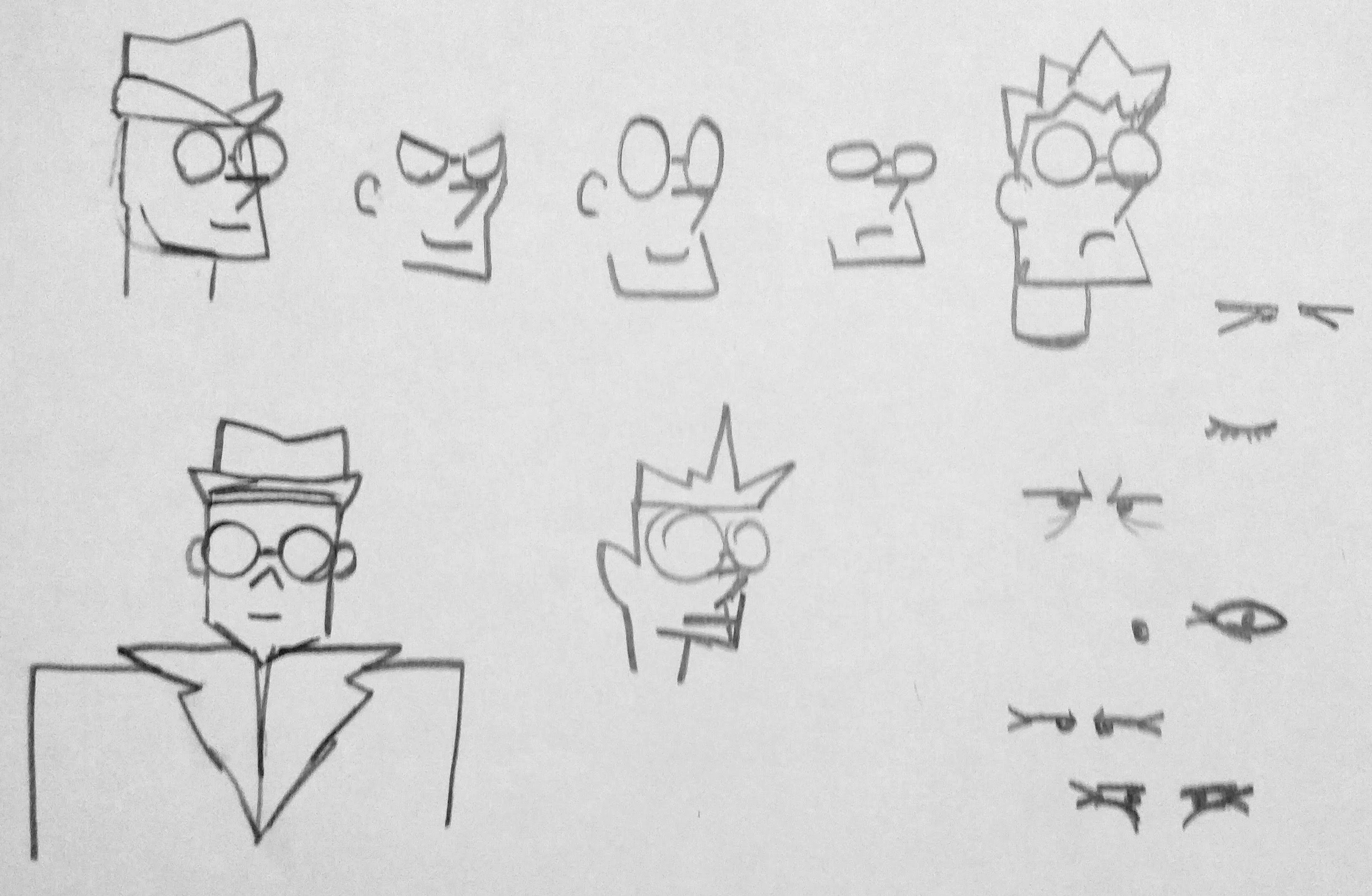
To have the slug reveal be more of a twist there needed to be another suspect. This would be Phil's neighbour, Andrea, who is the only other stamp collector in their small village. Phil sees her as a rival (the feeling of animosity is not mutual, and she has no issue with him aside from wondering what his problem is with her), and believes that she must have stolen his prized collection. The detective begins to grow more suspicious of her once a sock of hers (that actually blew in from the washing line during the storm) is found in Phil's garden.
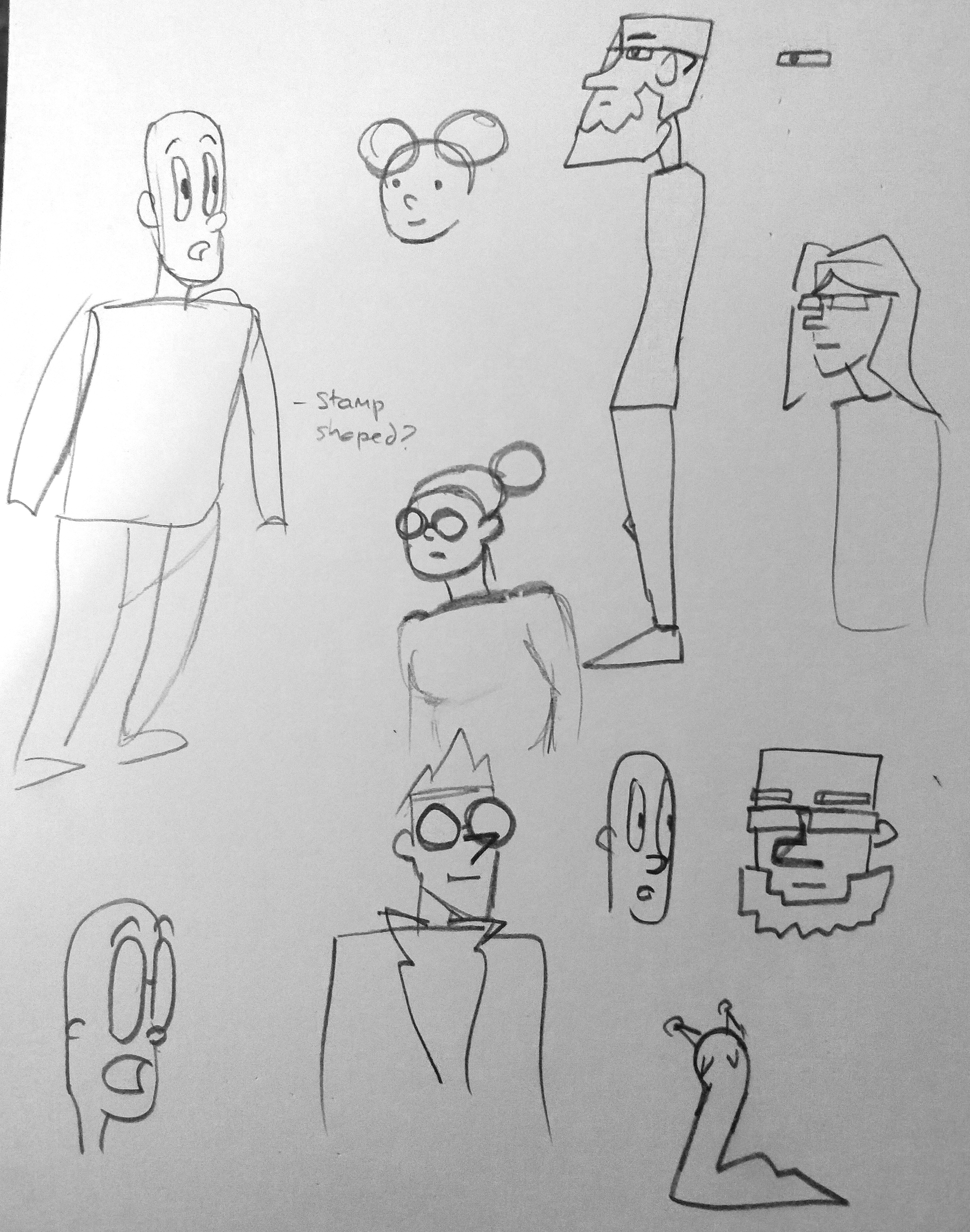
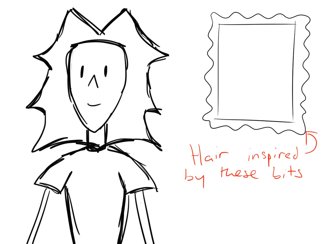
Once she arrives at the scene for questioning, she takes note of a large slug. She's heard about slugs eating stamps and believes it to be the culprit. The slug tries to escape (there would be a shot from above resembling a helicopter POV police chase) but is caught and eaten by a bird before it can be brought to justice. In a post credits scene, the slightly stamp floavoured slug is then spat out by the bird who exclaims "YUCK". Some crows can mimic speech so for a while I dreamt of befriending a crow by leaving out seeds, and saying "yuck" any time it was around so it'd copy me and the line could be voiced by an authentic crow. I also planned for the slug to feel queasy after hitting the ground so that it could then puke up the stamps to have more of a resolution to the plot. I decided it would be too gross though.
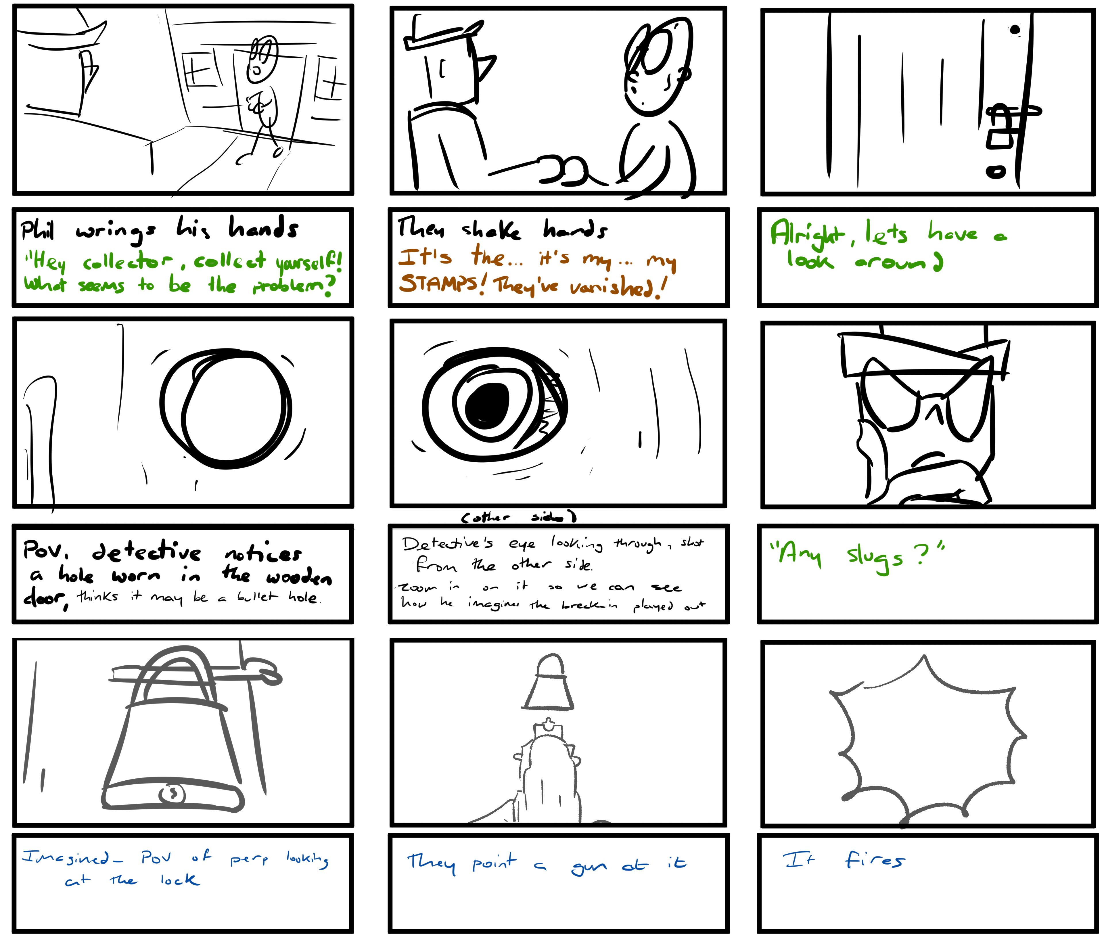
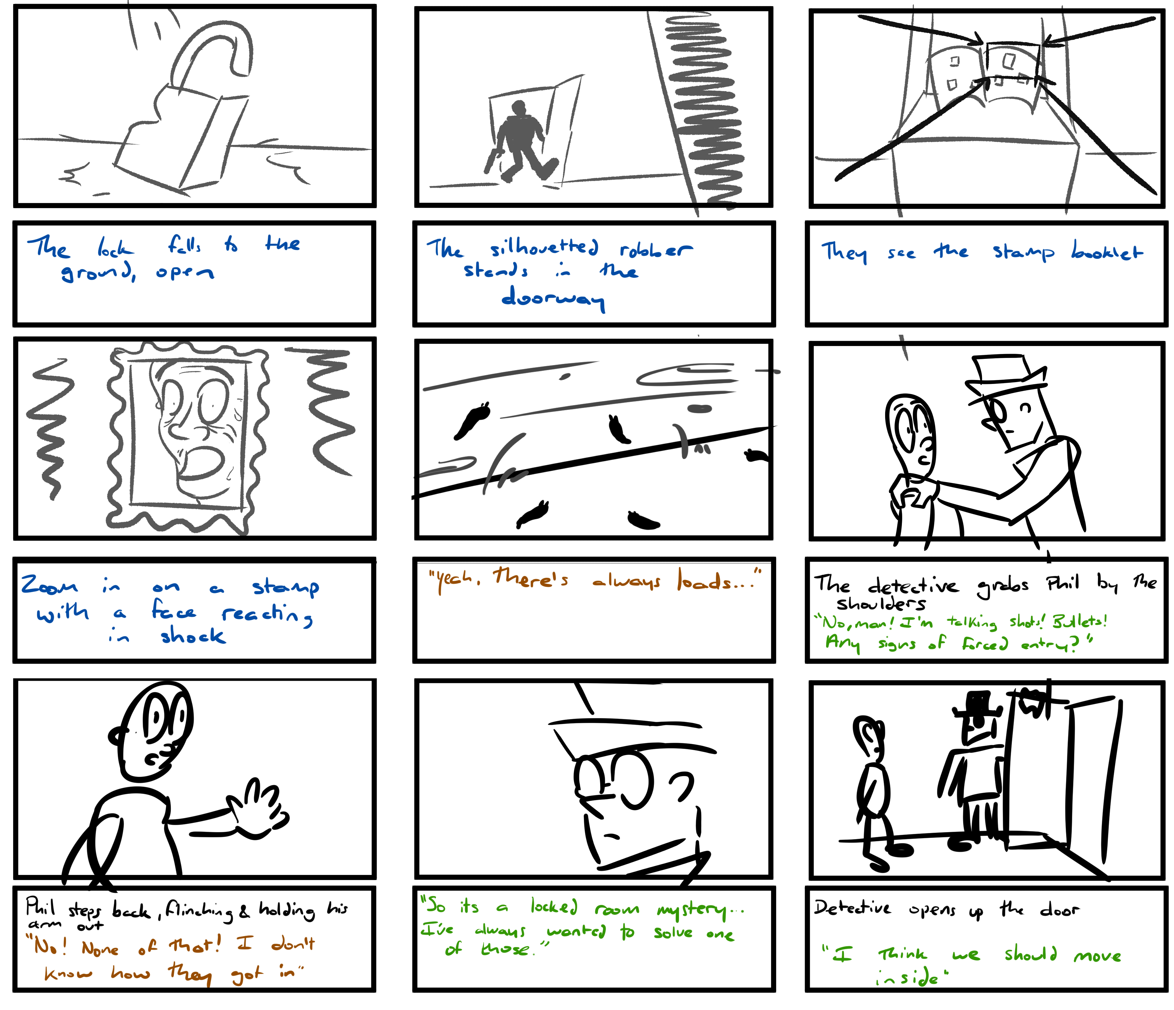
Parts of it would've taken place in the detective's wild imagination (seen here with the blue text and greyish visuals). Looking back at the storyboards now I feel like there were a lot of funny jokes in this version. I don't want to post the animatic here because it has my awful voice acting and I don't want to click anywhere within 100 pixels of that file so I might re-edit it so that the text and directions are on screen like. I wasn't all that happy with this version of the plot at the time, but ultimately the major reason I dropped it wasn't the quality but the fact that the animatic was FIVE MINUTES long, with full voice acting, 3 human characters as well as a slug and a bird (who appears in one single shot), and several largely outdoor locations. It just would not have been tenable for a 4th year film. Anyway before I get on to it being completely overhauled, here's a few more design images.
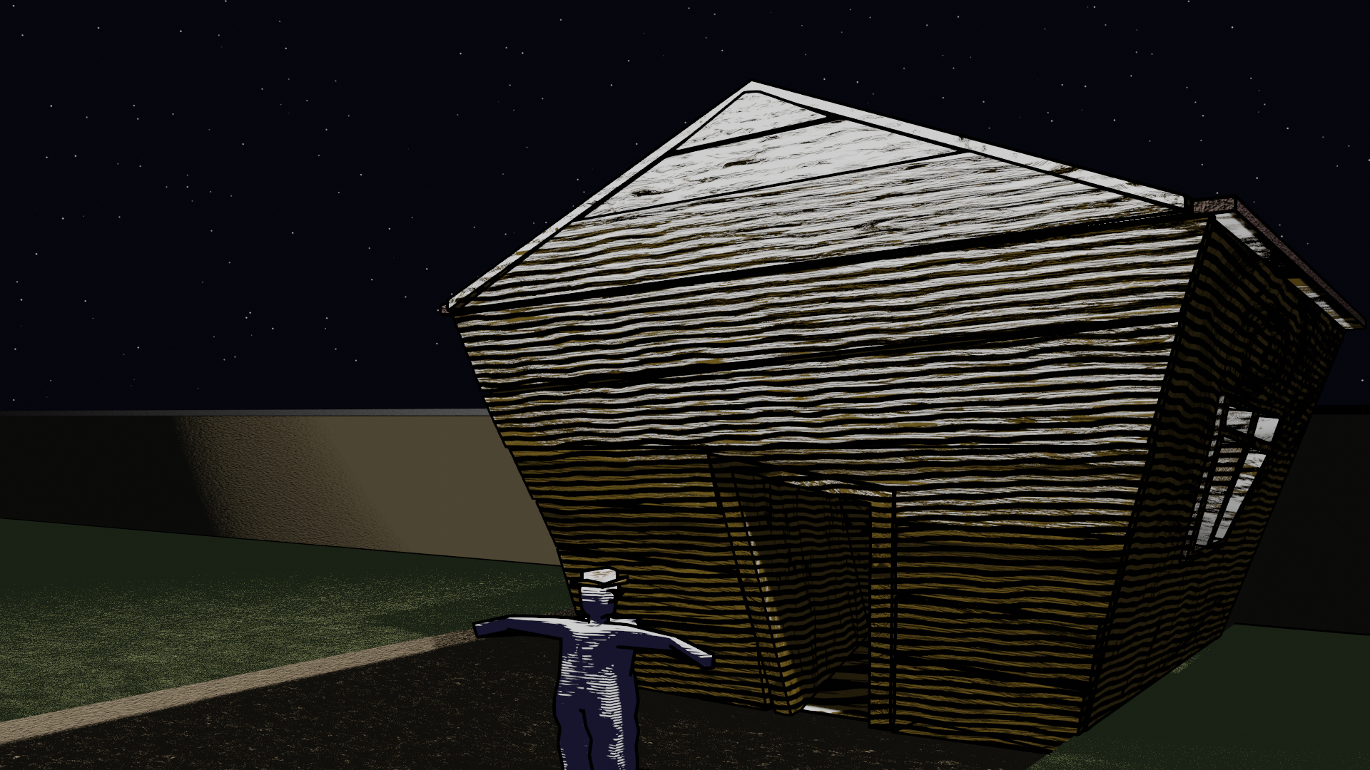
By this point I was experimenting with shaders and visual development. I settled on a sort of hatched style of shading, half inspired by the noir cliche of light streaming in through blinds, half taken from the style of shading on some old stamps. I kept this idea all the way up to the final film despite neither of these aspects being relevant anymore. I just liked how it looked.
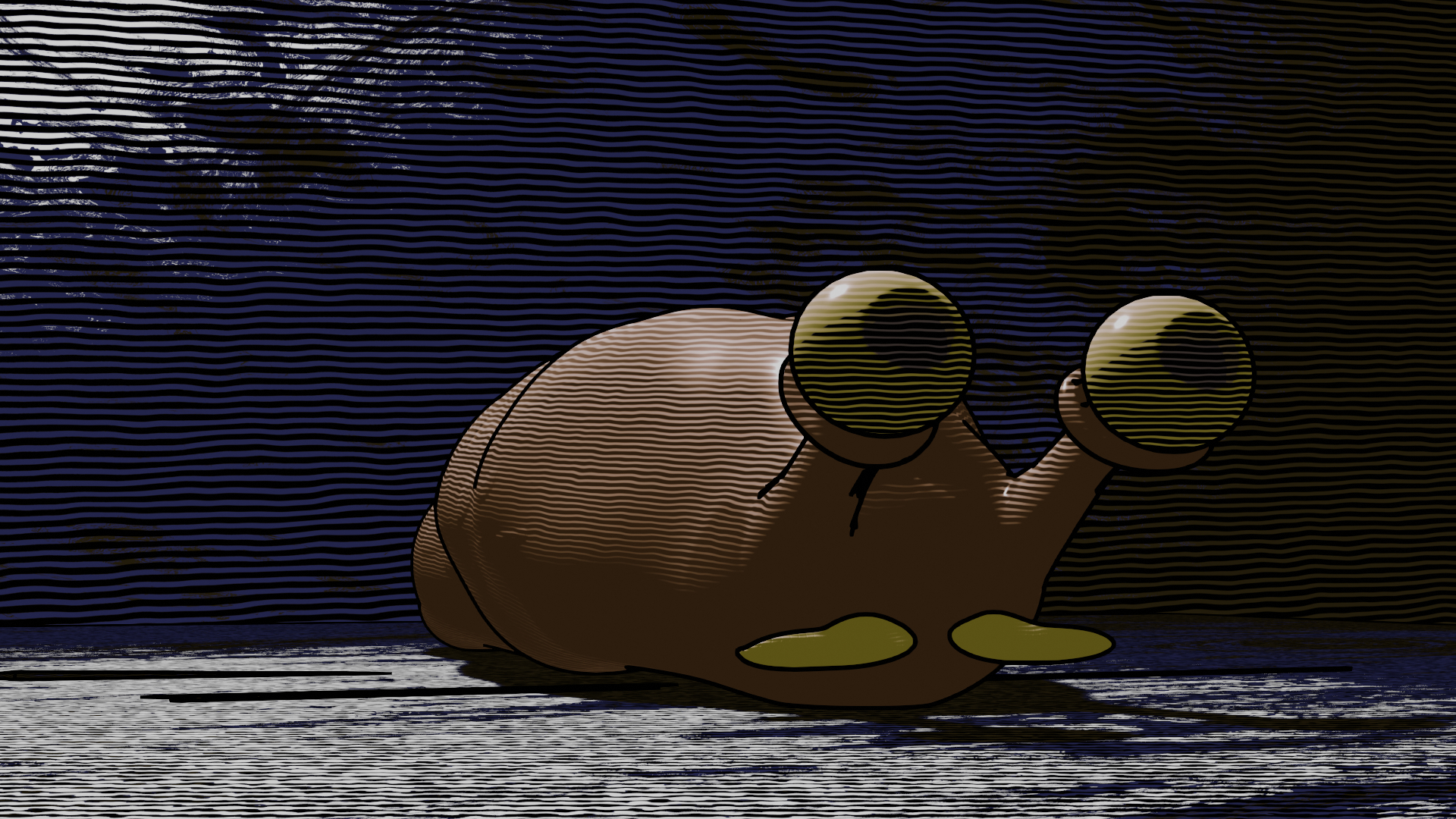
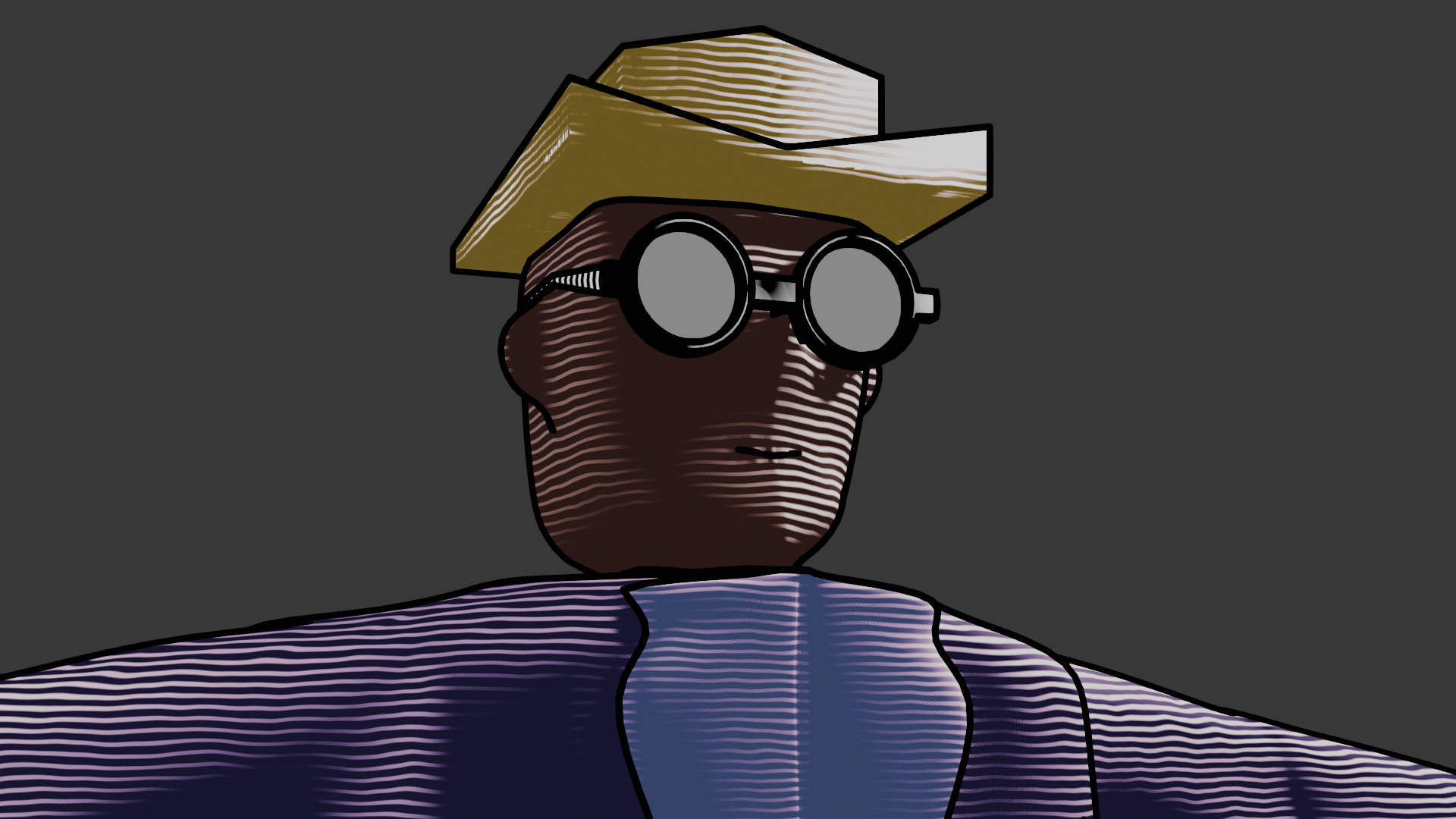
Despite being aware that the story as it was wasn't working, I didn't touch it at all over summer. I worked on my reclusive cave spider man idea instead. When I got back to college afterwards I had no idea where to take the film really. This was definitely the messiest phase of production. I think most of what I was doing at the time was more in my head than on paper so I don't have much to show for it (tho maybe it's in a sketchpad I'm forgetting about?) but I went back to the heist idea. This time the slug was stealing from the stamp collector. Thinking about it now I'm fairly sure I didn't have any obstacles or anything in mind for him to be getting past, I think he was just swinging in from the roof (because slugs can hang from a string of slime, more on that later) and crossing the hallway of the man's house. I'd done some reading on fun slug facts and found that they can only kinda see in terms of light and dark and that they can sense it to some extent through their body as well as their eyes so there were going to be some POV Wolfvision style shots with a blurry black & white filter.
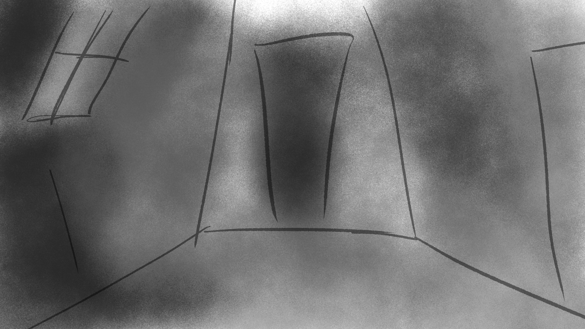
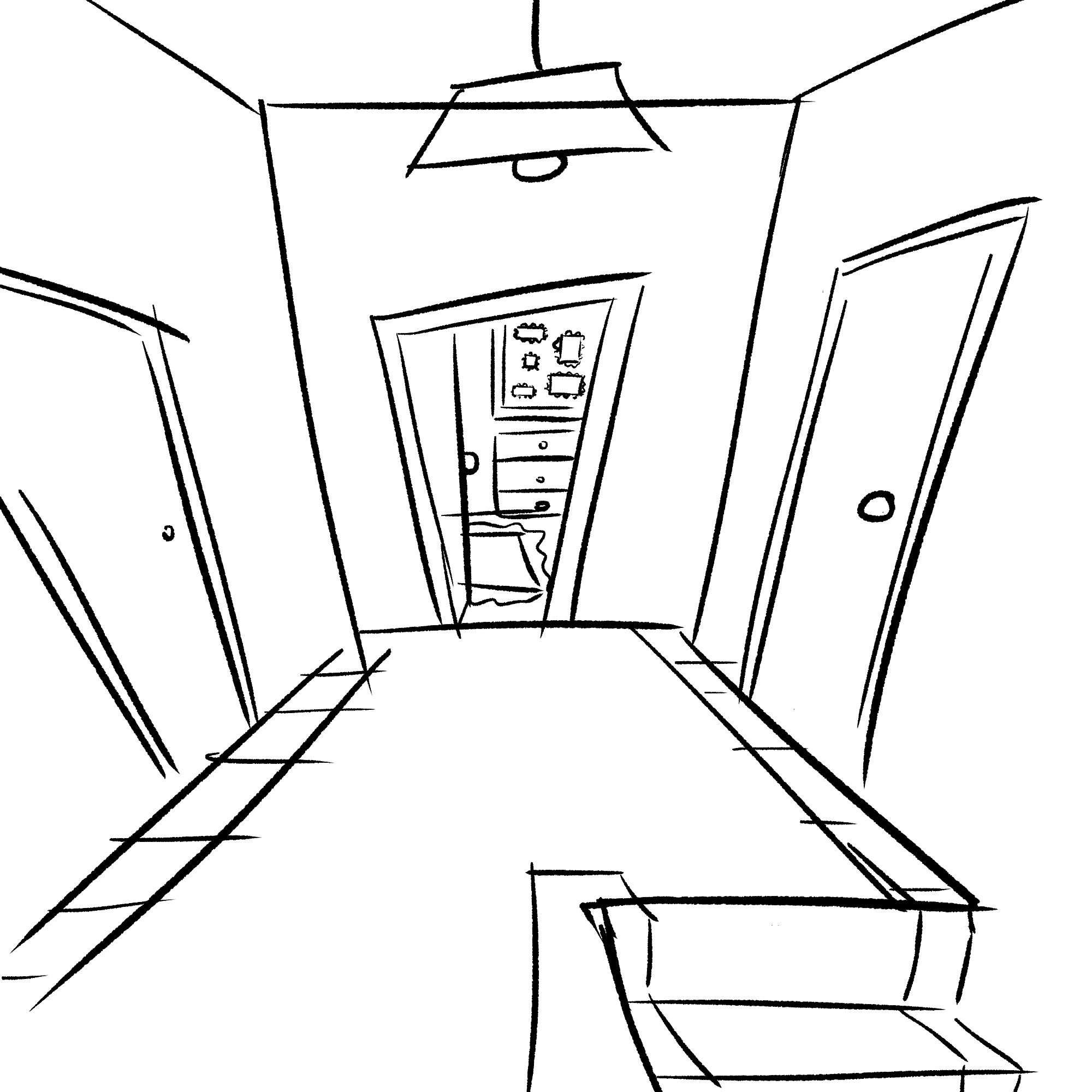
I really wanted there to be a bird character, so the slug could have a natural enemy. Or possibly a surprising friend? Yeah at this point I was toying with the idea of having a bird be a getaway driver/flight for the slug. Also I think the detective was still around in some fashion, and so was the stamp collector. None of these inclusions were justified really as the main story pretty much only involved a slug crossing a hallway
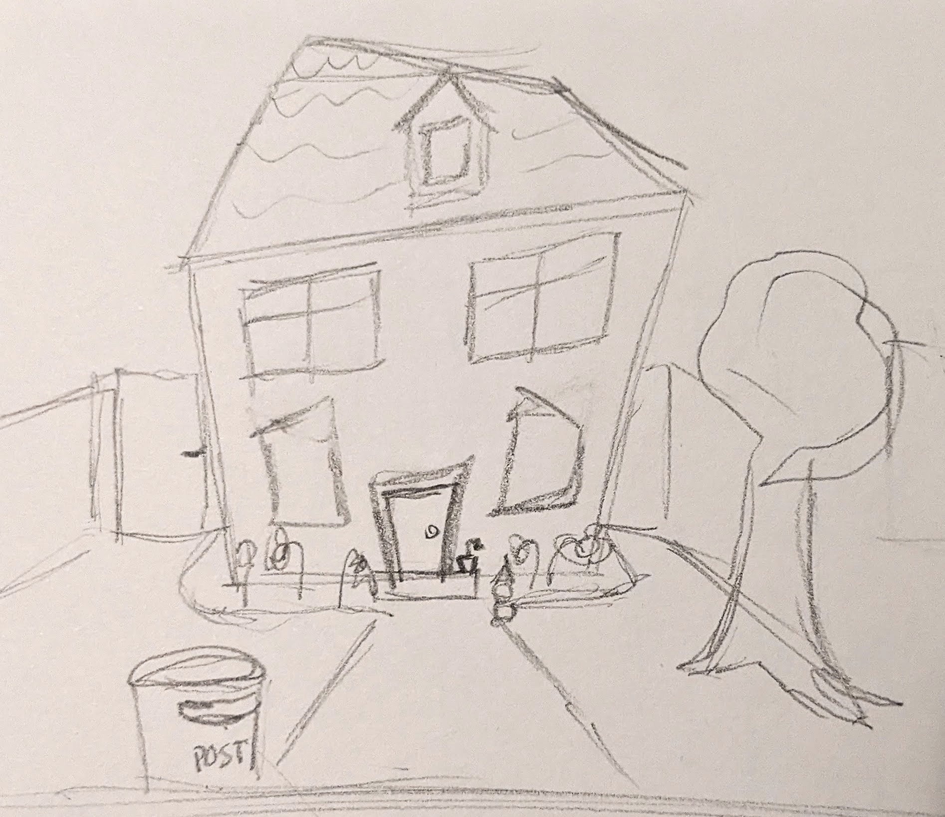
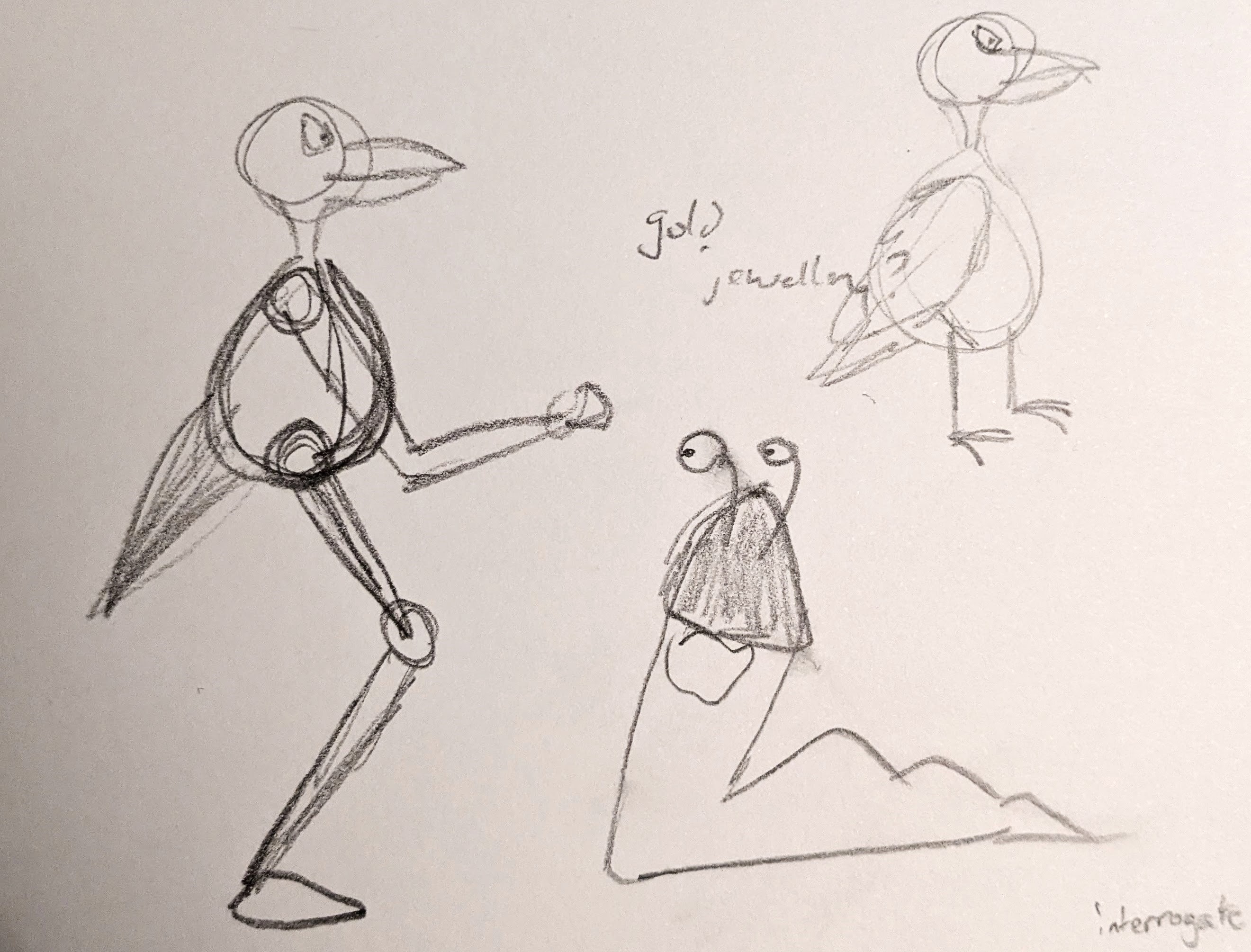
It was the night before I had to make a presentation about my progress that a new idea suddenly hit me. Actually I think it had sort of been in my head for a while but it was only here that I really put it together. The story would revolve around a few separate people: a man at a pub, a stamp collector, and a man buying flowers. They'd each have a ~30 second long "chapter" where they'd be in a fairly mundane situation with some underlying tension, and at the end of each section something would go wrong for them. I'd watched Better Call Saul over the summer and it had a good few moments where they really played with tension and I wanted to capture a bit of that. I really wanted there to be a slowness and an uneasiness to it all. You'd be left wondering what's going on and how all of these events connect until the end, when it's revealed that the slug was behind all of it!
I'm not entirely sure how to structure things from here on out since I was kinda working on everything at once so I guess I'll just go through the whole character design process, starting with a character that was cut. I never really had a name for him other than "Flower Boy", since being the guy that bought flowers is kinda the only real character trait he ever had. He's also the guy that gets decked in the pub, partly because there had to be some repeated characters in there to save time, partly because I wanted to play around with a kinda non linear story, where we'd see him depressed at the bar and then find out later on that it was because his girlfriend broke up with him. She was also meant to double as the stamp collector character but I never came up with a way to tie that into the overarching story. In my mind this version with 3 sections and the slug reveal was a really important part of the film's development but now that I'm looking back at all the files it's looking like I only worked on it for about a week before cutting it down to a version with just the pub, and ultimately a version with just the drunk man (who was initially a minor character) and the slug. Anyway here's a sketch I did for Flower Boy, hope you enjoy it cuz you're never seeing him again lol.
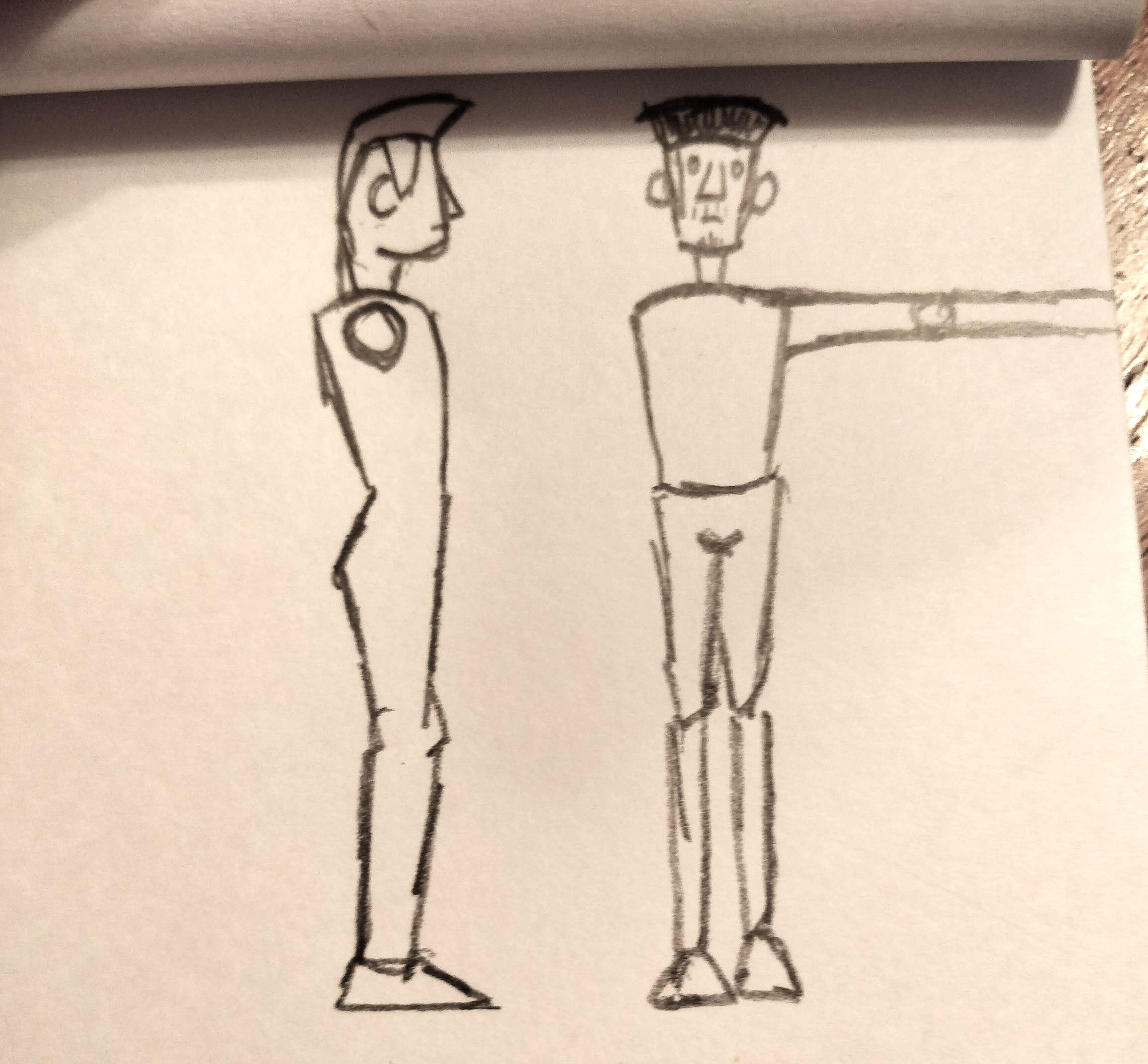
Now on to a more important character, the drunk man at the pub. Initially the only idea I had for him was that he'd be sort of round and squat, with some pointiness and edge. A jolly looking man but one who could pack a fair punch.
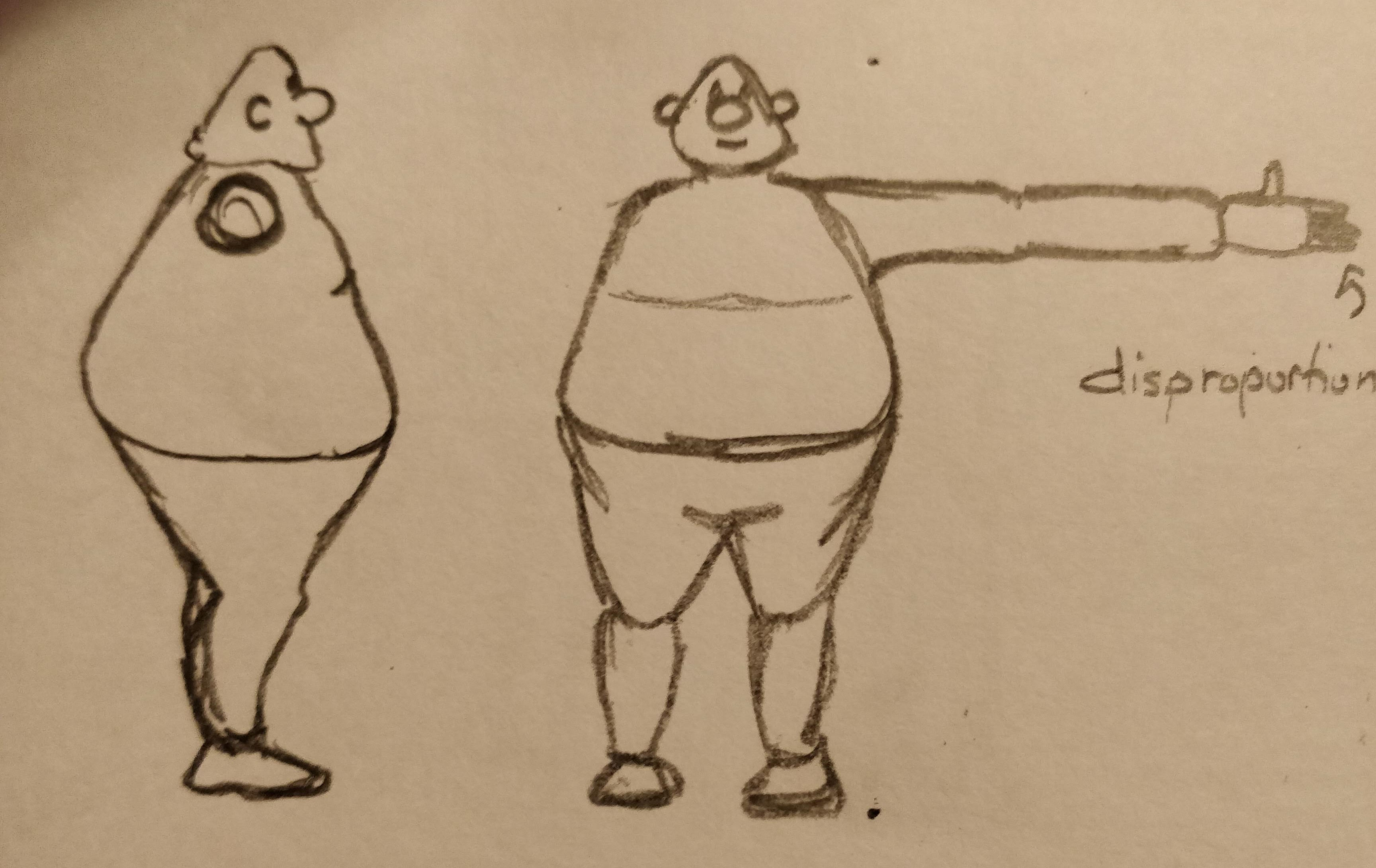
As I thought about his design more I realised I was still OBSESSED with the idea of including a bird character, and now was the perfect time to include elements of that. It's only natural that the slug's enemy would be a bird, the same as how a mouse's enemy would be a cat. So I set out to design a man with birdlike features.
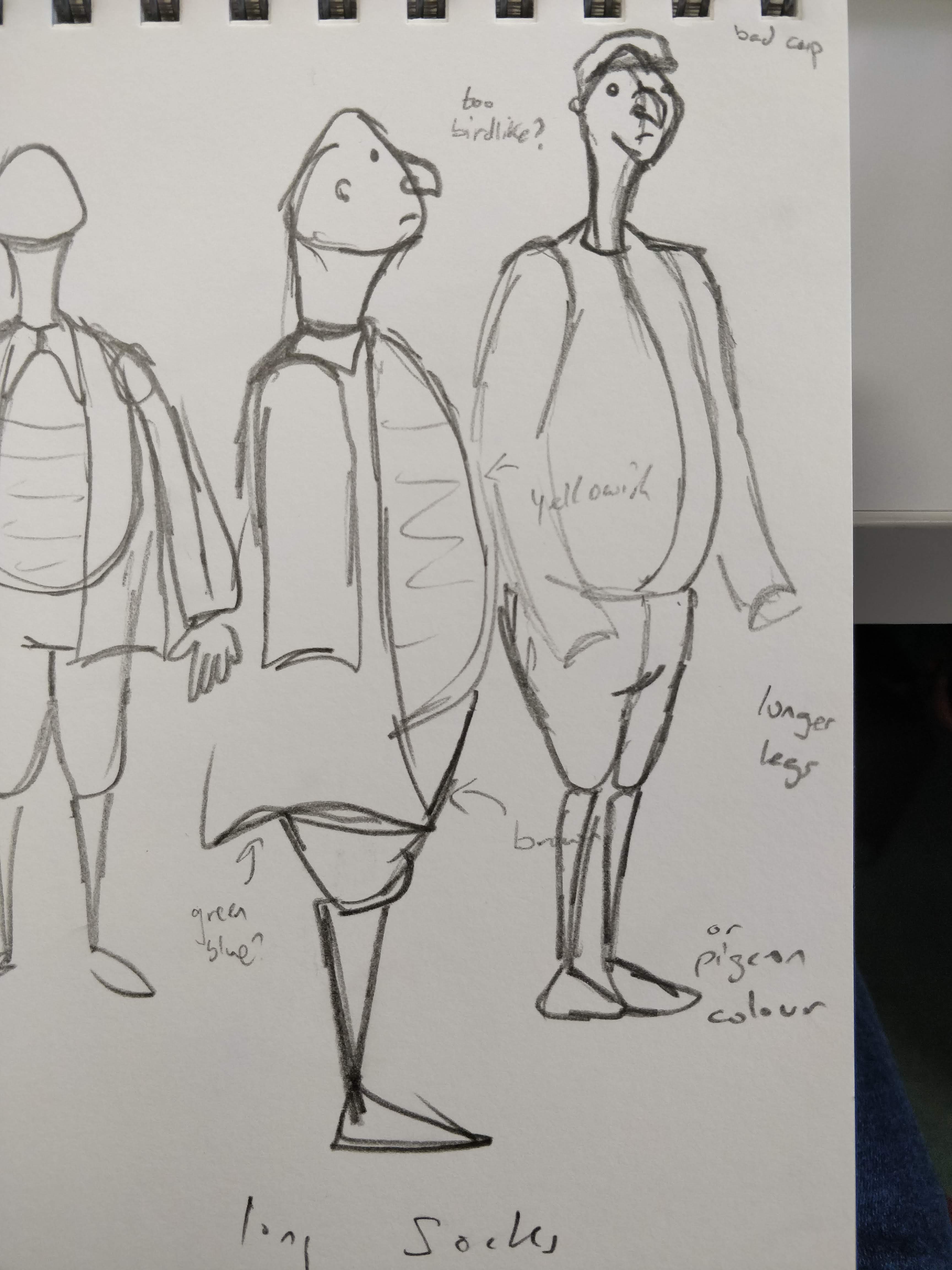
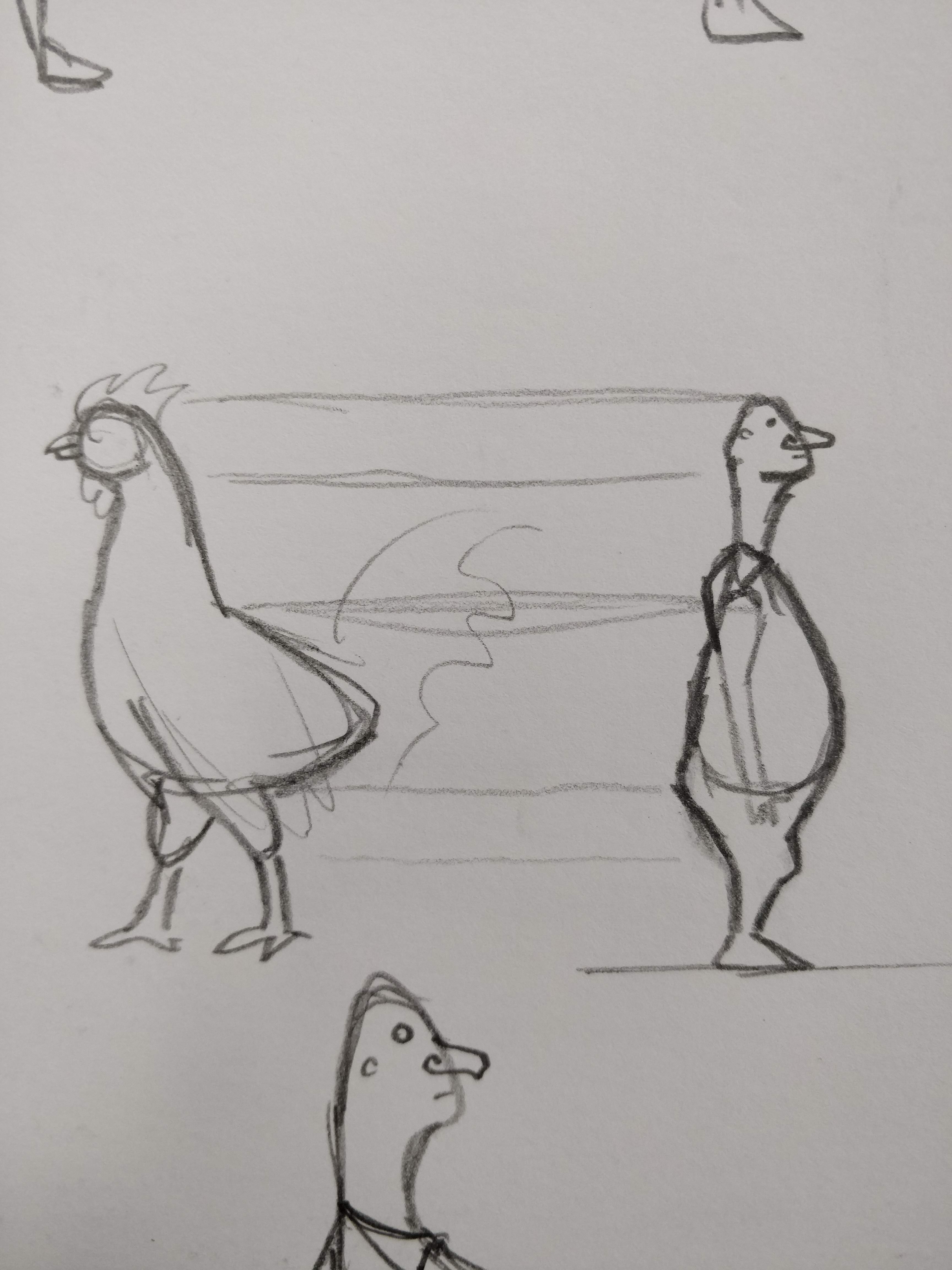
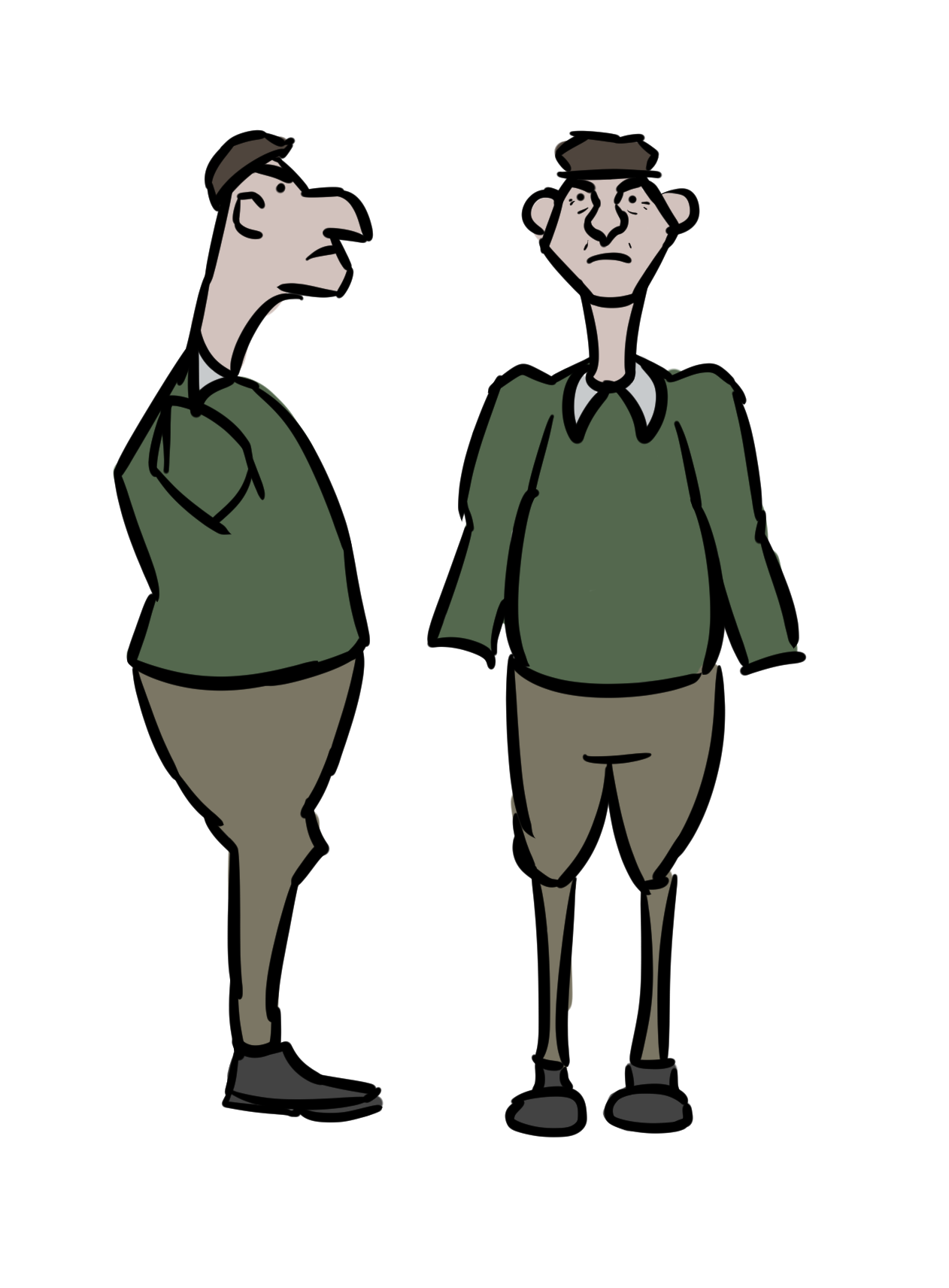
At first these were really prominent but they didn't feel right for the character, he'd lost his roundness, his friendlier side. I'm not sure how it all came together in the end, or what type of bird I specifically had in mind (I think probably a robin or pigeon, he's wearing piegon colours here but he had brown and red clothes for a while after I'd modelled him, until I realised most of the set would be very brown and the I changed it back to vaguely pigeony colours) but a new design came out the end of my wacom stylus at some point and it only went through some very minor changes after that.
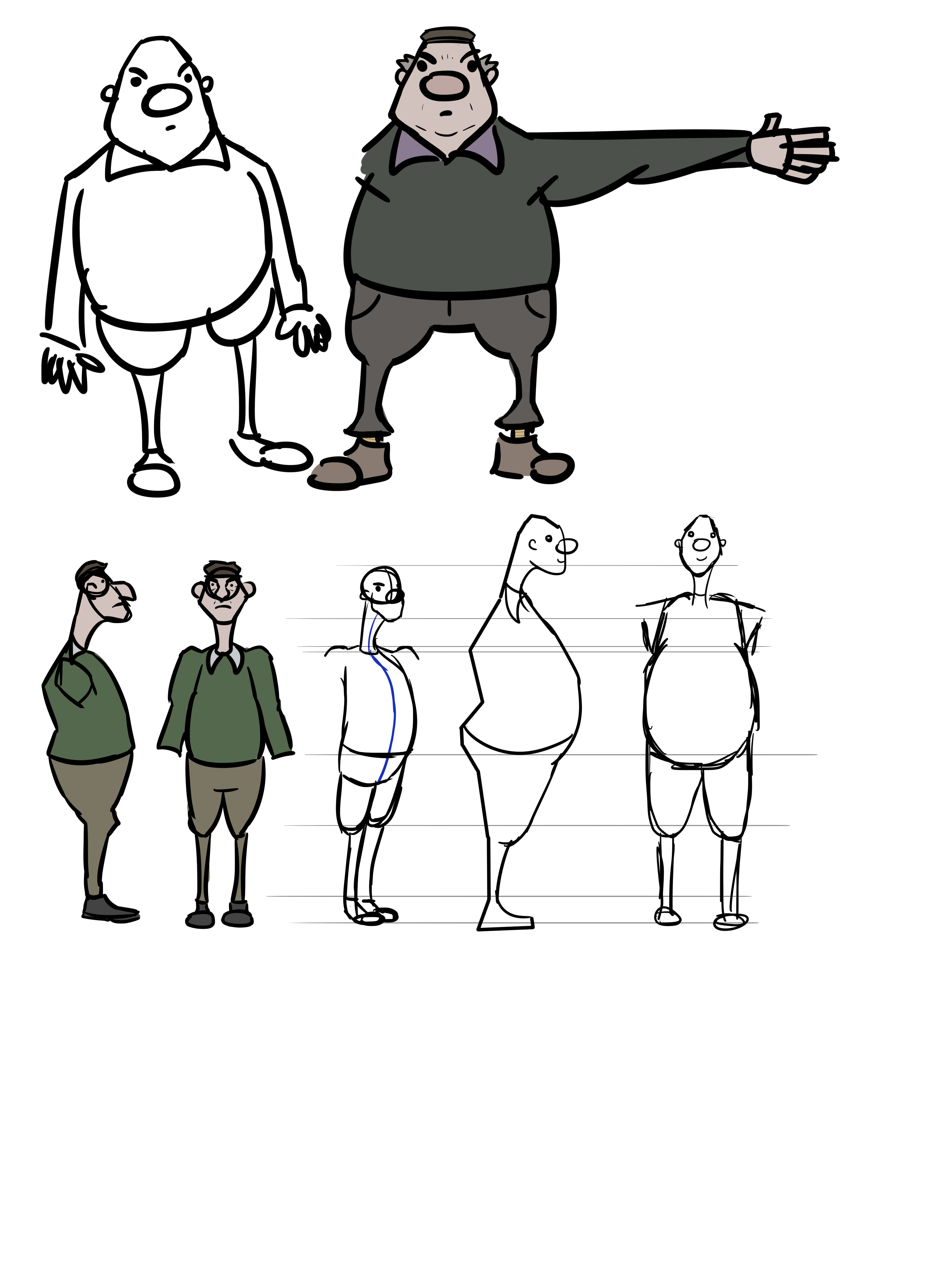

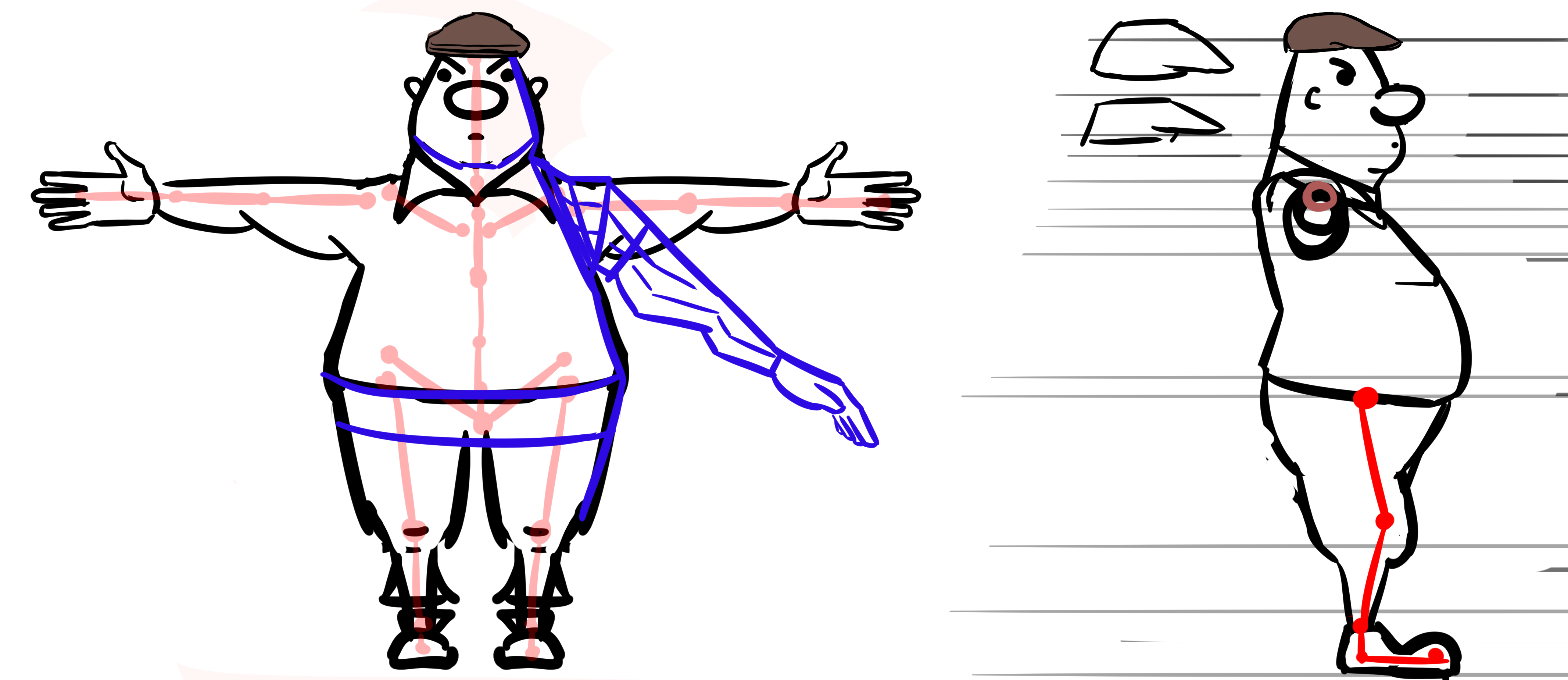
I really wasn't thinking in terms of modelling or rigging at this stage. I didn't even know that I was supposed to be working with an A-pose base mesh when I drew up the design! Anyway it worked out fine in the modelling stage (I'll get to that later I think) and rigging it was an interesting experience that I almost certainly could've done more effectively but it worked well enough. Anyway, on to the slug. I didn't put as much thought into him. Even though there was like a whole year where I head the slug idea in my head I didn't really use that time to design one. I think I just drew out a version and thought "yeah that'll do" then made a few tiny alterations. The slug's angularness comes more from the fact that I was really inspired by Ghost Trick and how the characters look in that than being a reflection of its character. Same goes for the man but it's more prominent with the slug. I guess his edgy side shows more because of his thieving nature.
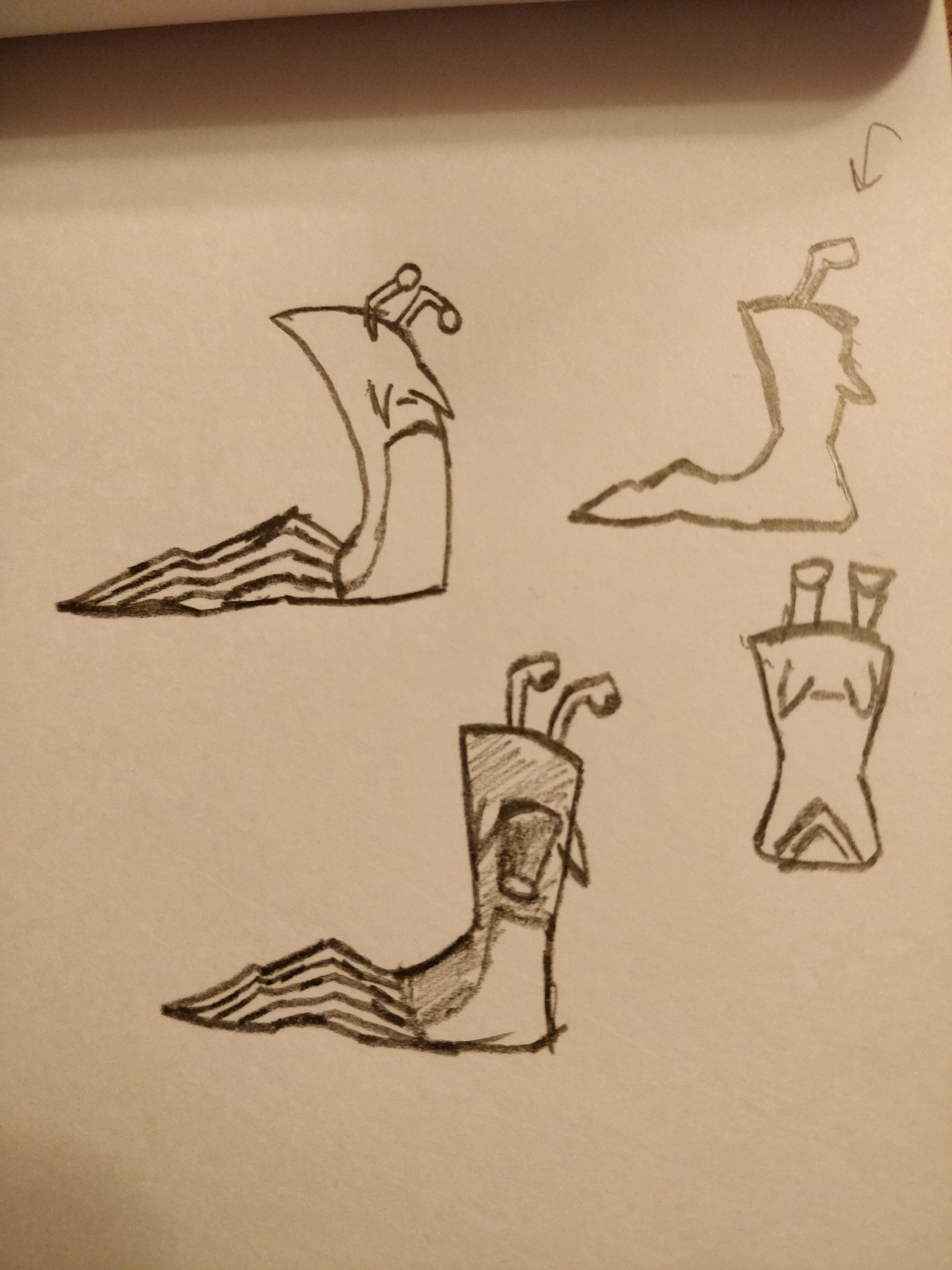
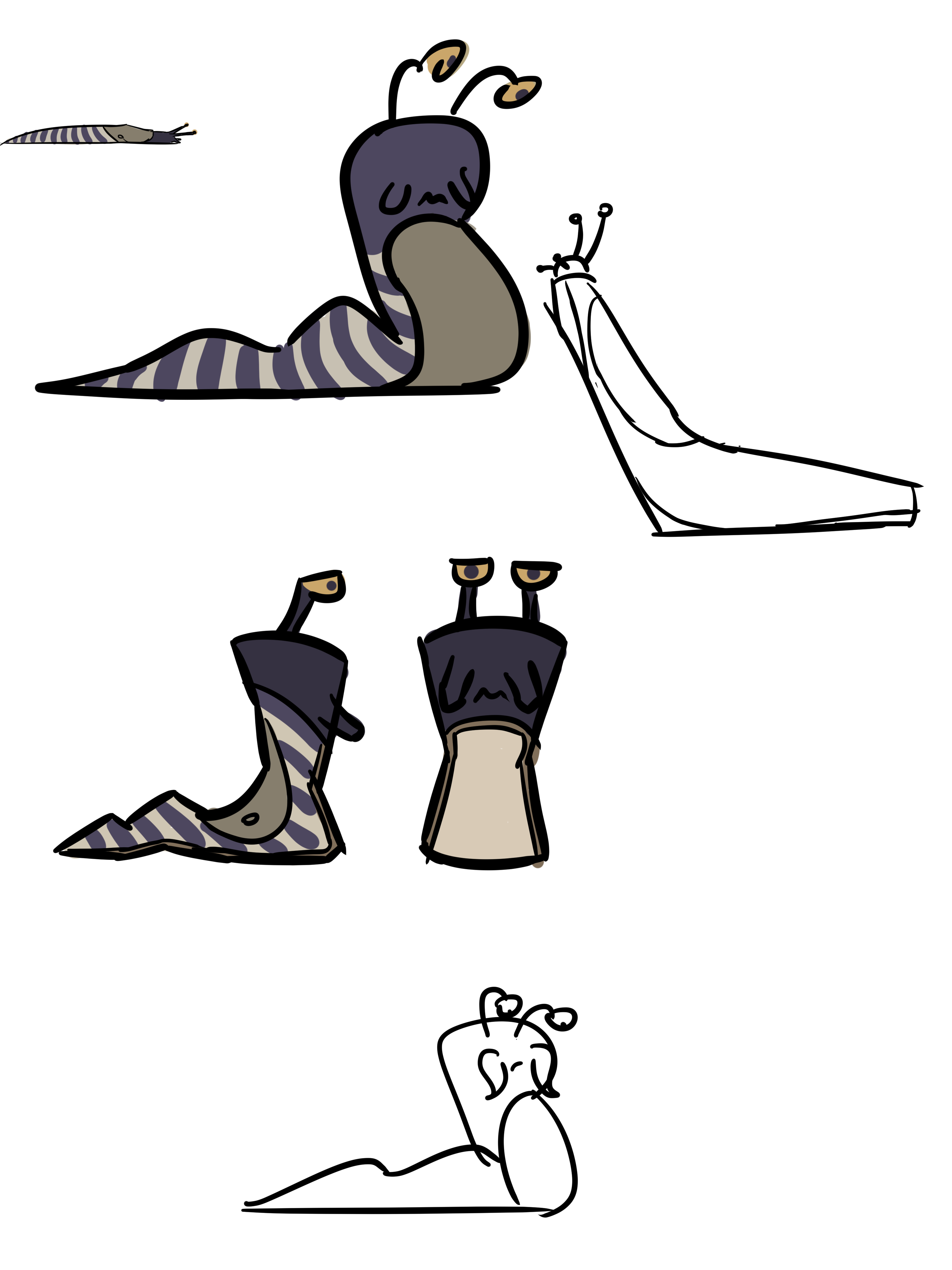
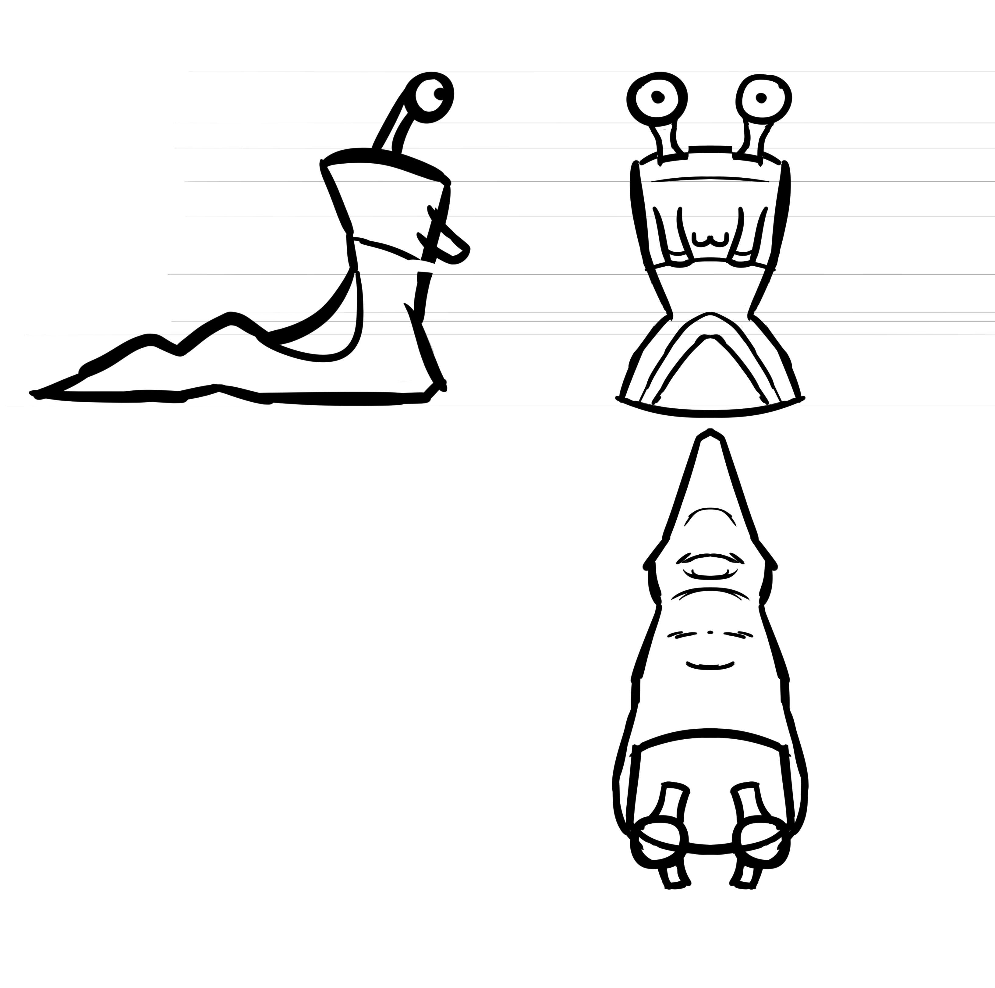
I'm not sure why I went with a purple slug in the end. It might've been a placeholder that just stuck? Or maybe it was to do with the fact that I went with a stripey/hatched shader that I was afraid would clash with the robber costume stripes? I think I just liked him that way.
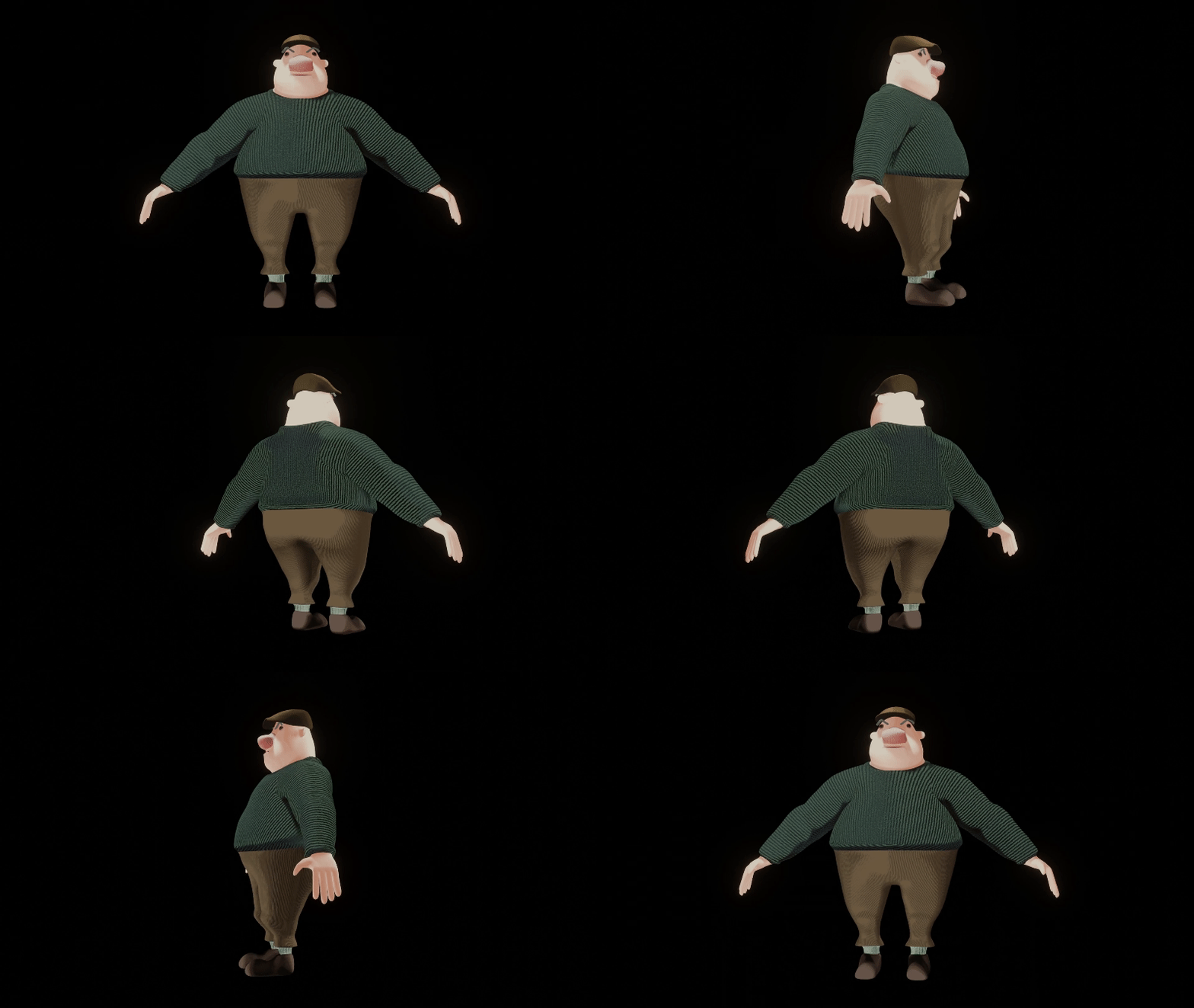
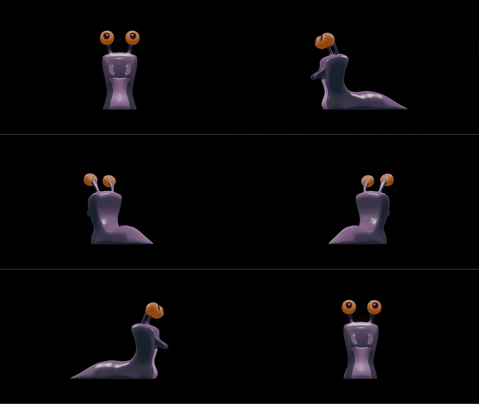
I'm not really sure what to say about the character models. I have a few work in progress renders and screenshots but I don't think they're all that interesting to look at. Modelling the slug was easy enough as far as I remember. The man was much more of a hassle. He had a shirt collar that I ditched in the end because I couldn't get it to play well with the rig (looking back it probably should've been separate from the body mesh), the topology was all over the place and still pretty uneven after I "fixed" it & his short legs didn't always work as effectively as planned. It was a real learning experience. Figuring out how to deal with the eyes and mouth was definitely a challenge also. For a while I considered just having a mouth texture but I wasn't sure how to make him spit or drink with that and it felt like it'd be more effort.
they are in the microwave